Formative Inquiry
Needs research with BLV climbers and support stakeholders.
We evaluated HoldLight through a staged human-centered testing process. Phase A focused on understanding the needs of blind and low-vision climbers and supporting stakeholders. Phase B used pilot testing to refine the most fragile parts of the interaction: preview density, cue wording and timing, and fallback behavior. Phase C compared HoldLight with a standardized current-practice human-support baseline in controlled indoor climbing tasks.
The goal of testing was not only to check whether the system could recognize holds, but to evaluate whether the workflow helped users understand routes, receive low-overload guidance, recover from uncertainty, and remain in control while human safety support stayed available.
Needs research with BLV climbers and support stakeholders.
Small-scale testing to tune preview density, cue timing, and fallback behavior.
Within-subjects comparison between HoldLight and a standardized human-support baseline.
To meet the coursework requirement for alpha usability testing, we tested the early HoldLight prototype with three participants: two blind or low-vision climbers and one sighted assistant as a secondary stakeholder. The goal was to identify usability issues in the prototype flow before final refinement, not to claim final effectiveness.
3 alpha testers: P1 and P2 were BLV climbers, and P3 was a sighted assistant / secondary stakeholder who checked setup, correction, and fallback boundaries.
Alpha web prototype with the main HoldLight workflow: route scan entry, layered preview, brief guidance concept, fallback controls, and route correction interaction.
Task-based walkthrough, observation notes, short feedback questions, and comparison between intended requirements and actual user interaction.
To identify whether the prototype supported route understanding, reduced information overload, and made recovery actions clear enough before the final portfolio refinement.
Users were asked to find the scan or upload entry point and understand what to do first.
Users reviewed the overview, segment-level information, and drill-down structure to check whether the route information felt easier to follow than a long explanation.
Users reviewed example cue wording and checked whether direction-first cues felt clear, short, and action-oriented.
Users checked whether repeat, more detail, pause, help, and route correction options were visible and understandable.
Early feedback showed that users could understand the idea of scanning the wall, but the entry point and first action needed to be more visually obvious. This led to simplifying the scan entry and making the start action clearer.
Testing reinforced that one long pre-climb explanation was not suitable under climbing-related cognitive load. The preview was therefore organized into overview, segment, and drill-down layers.
Verbose instructions were easier to understand while standing still, but felt too heavy for in-climb use. This supported the direction-first cue format, such as hand, clock direction, and coarse distance.
Users needed clear ways to recover when information was missed or unclear. Repeat, more detail, pause, help, and manual correction options were therefore treated as visible interaction controls rather than hidden backup behavior.
We conducted alpha usability testing with three participants: two blind or low-vision climbers and one sighted assistant as a secondary stakeholder. The purpose was not to claim final effectiveness, but to identify usability issues in the prototype flow, route preview, audio cueing, and fallback support before final refinement.
| Participant | User Type | Testing Focus | Key Finding | Resulting Refinement |
|---|---|---|---|---|
| P1 | BLV climber | Pre-climb route understanding and route preview flow | A single long route explanation was difficult to retain before climbing. The participant needed a clearer overview first, followed by optional details. | Refined the route preview into an Overview → Segment → Drill-down structure. |
| P2 | BLV climber | In-climb audio cueing, repeat action, and uncertainty recovery | Verbose or delayed cues interrupted climbing rhythm. Short direction-first prompts were easier to act on while moving. | Simplified audio guidance into brief direction-first cues and made repeat / more detail actions more visible. |
| P3 | Sighted assistant / secondary stakeholder | Setup support, scan correction, and human fallback boundary | The assistant needed a faster way to correct detected holds and a clearer point where human help should re-enter the workflow. | Improved manual hold correction, added batch-edit support, and clarified explicit fallback states such as pause and human help. |
These alpha findings directly informed the final refinement priorities: layered route preview for route memory, brief audio cueing for low cognitive load, and clearer fallback controls for moments when system guidance or user confidence was insufficient.
This coursework alpha test with three participants was used as an early usability check. The broader research process also included BLV formative inquiry, pilot refinement, and a controlled evaluation, which are summarized below.
| Phase | Purpose | Participants | What it informed |
|---|---|---|---|
| Phase A: Formative Inquiry | Understand barriers, preferences, and success criteria | 11 BLV questionnaire respondents; 4 BLV interviewees; 5 secondary stakeholders including 3 sighted guides and 2 coaches | User needs, design goals, current support practices, communication breakdowns, and the boundary between automated support and human help |
| Phase B: Pilot Refinement | Stress-test preview, cue wording, timing, and fallback | 4 BLV climbers: 2 blind and 2 low-vision | Layered preview, shorter cue format, silence during active movement, explicit fallback |
| Phase C: Controlled Initial Evaluation | Compare HoldLight with standardized current-practice human support | 12 BLV climbers: 6 blind and 6 low-vision | Within-subjects comparison; each participant tested both Baseline and HoldLight. It measured route understanding, uncertainty recovery, human-help burden, perceived autonomy, cue usefulness, trust, safety, and acceptability. |
The main evidence came from BLV climbers and relevant support stakeholders: Phase A included 11 BLV questionnaire respondents, 4 BLV interviewees, and 5 guides/coaches; Phase B included 4 BLV climbers; Phase C included 12 BLV climbers.
We used accessible questionnaires, semi-structured interviews, pilot sessions, task-based usability testing, onsite observation, and post-condition feedback to connect user needs with design changes.
Phase C used a within-subjects comparison: each BLV participant tested both a standardized human-support baseline and HoldLight on difficulty-matched climbing routes.
Route understanding was scored with a 0-4 rubric, while observations tracked uncertainty breakdowns, clarification interruptions, human-help requests, fallback events, and safety-only interventions separately.
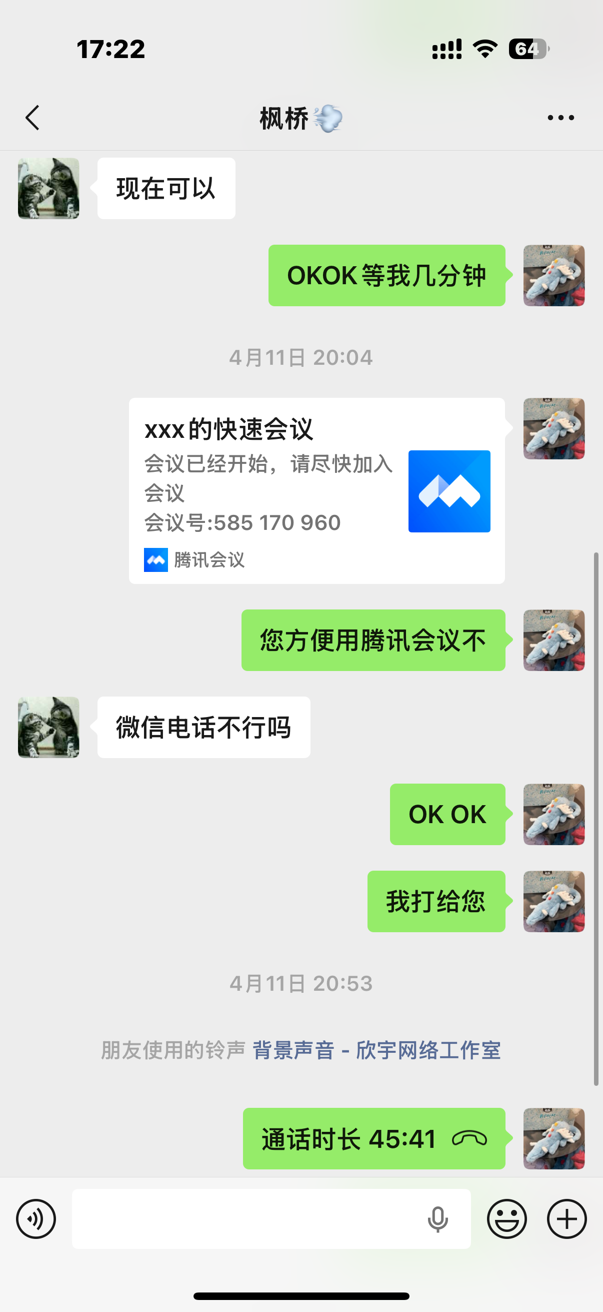
The evidence below follows the testing process from recruitment and preparation to internal checking and onsite climbing trials. Communication screenshots are treated as anonymized recruitment and follow-up evidence, so they are kept as supporting material rather than used as the main visual focus.
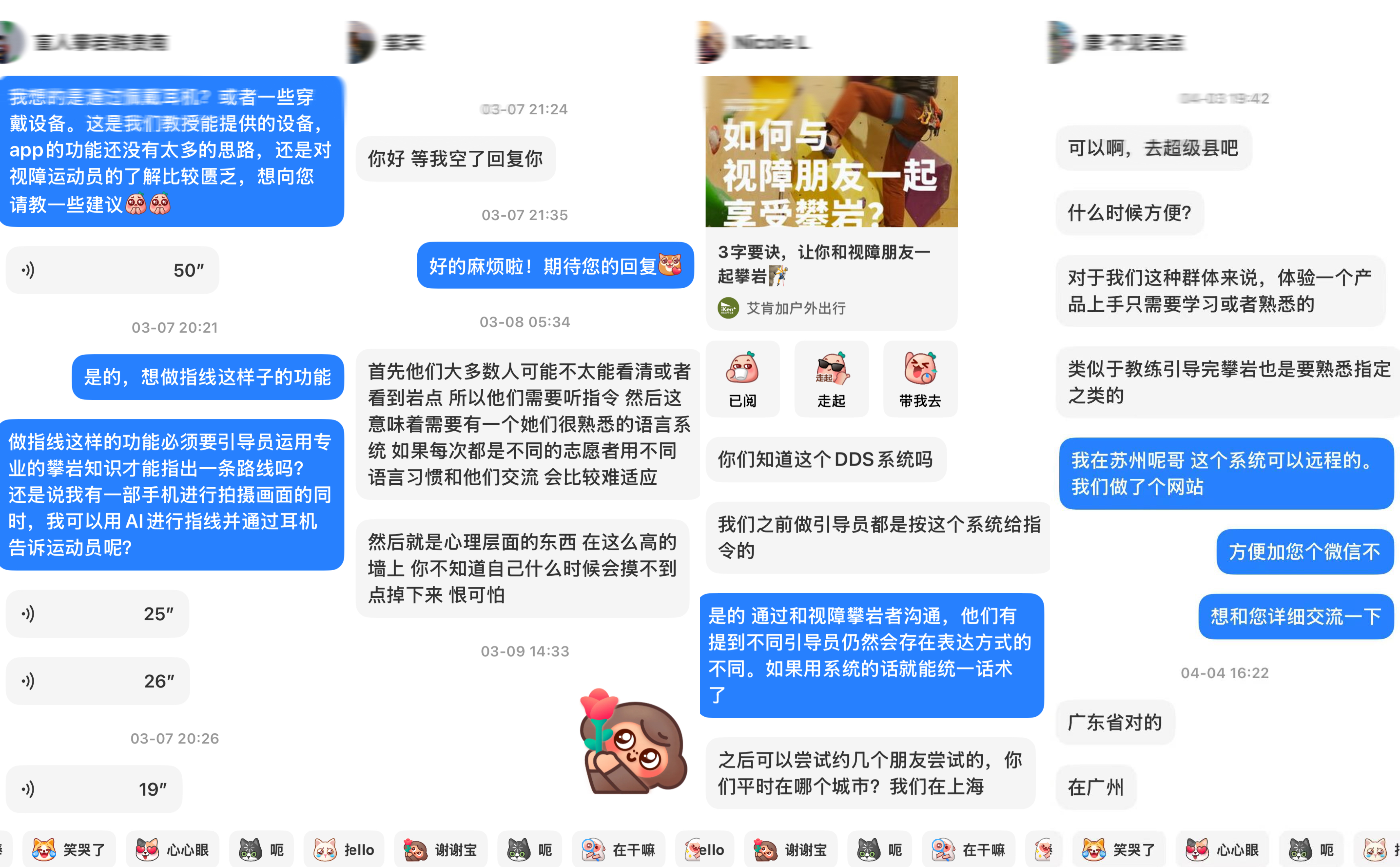
We began by reaching out to visually impaired climbing-related contacts to understand initial concerns, practical needs, and whether a guided climbing support system would be meaningful in real use.
Early communication helped us clarify core issues such as communication style, route guidance consistency, and the importance of safety and trust.
Design insight: This stage highlighted the need for clear, familiar, and consistent guidance language.
We then arranged and carried out a follow-up conversation with a visually impaired participant to better understand expectations, practical constraints, and suitable ways of communicating during testing.
This follow-up exchange supported recruitment and helped move from informal contact to a more structured interview and testing plan.
Design insight: This step helped us refine how to approach testing and communication in a respectful and practical way.
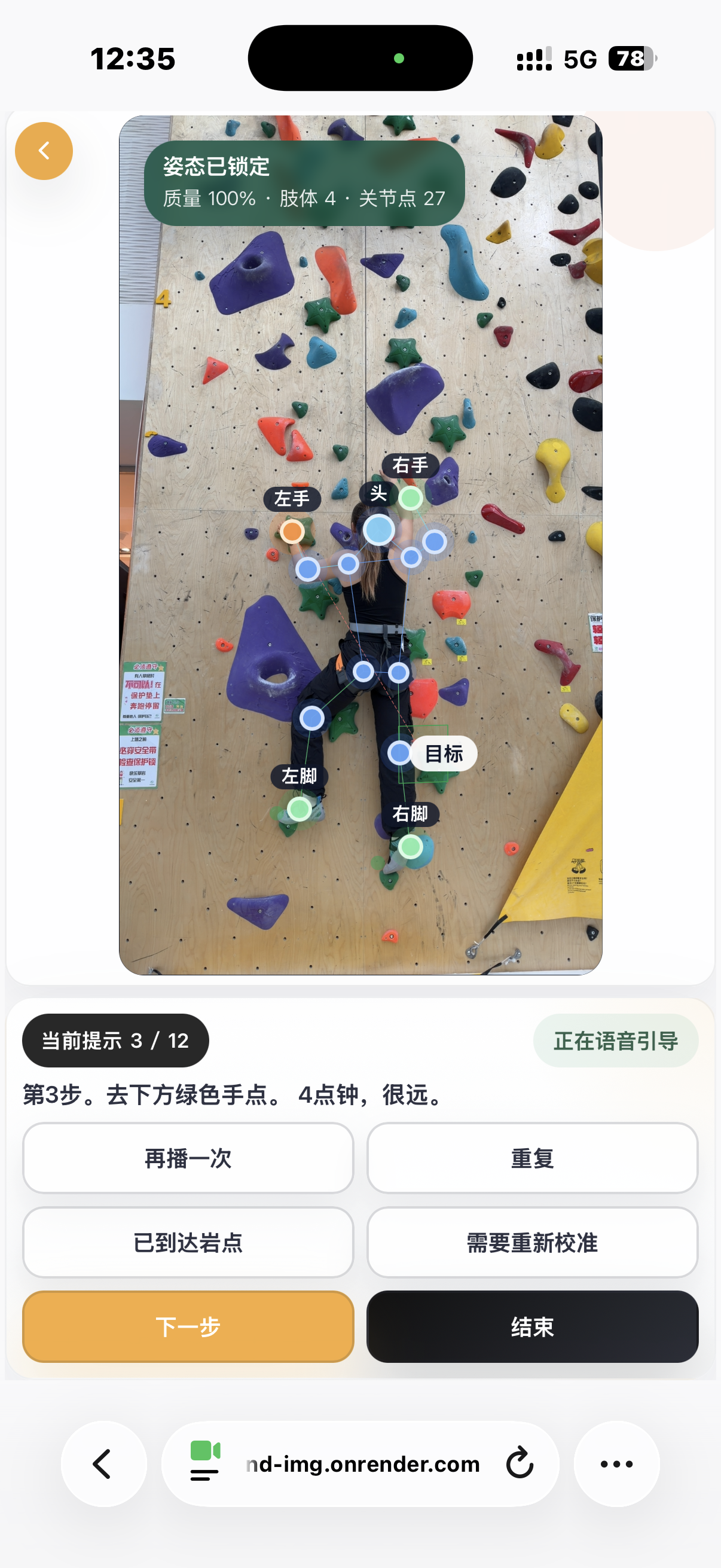
Before testing with external participants, we used internal trials to check whether the interface, guidance panel, and route-related interaction could be understood and operated on mobile.
Internal testing allowed the team to quickly verify the clarity of instructions, screen layout, and the feasibility of scan-based interaction.
Design insight: This stage helped us identify interaction issues before moving into more realistic climbing scenarios.
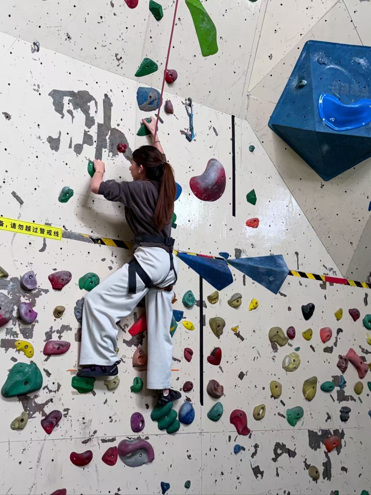
We observed a participant trying the climbing task in practice in order to understand body movement, hold reachability, and how route guidance should align with actual climbing behaviour.
This trial helped us connect interface design with the realities of movement, balance, and hold selection on the wall.
Design insight: Testing in motion revealed the importance of short, well-timed guidance and a realistic understanding of physical climbing constraints.
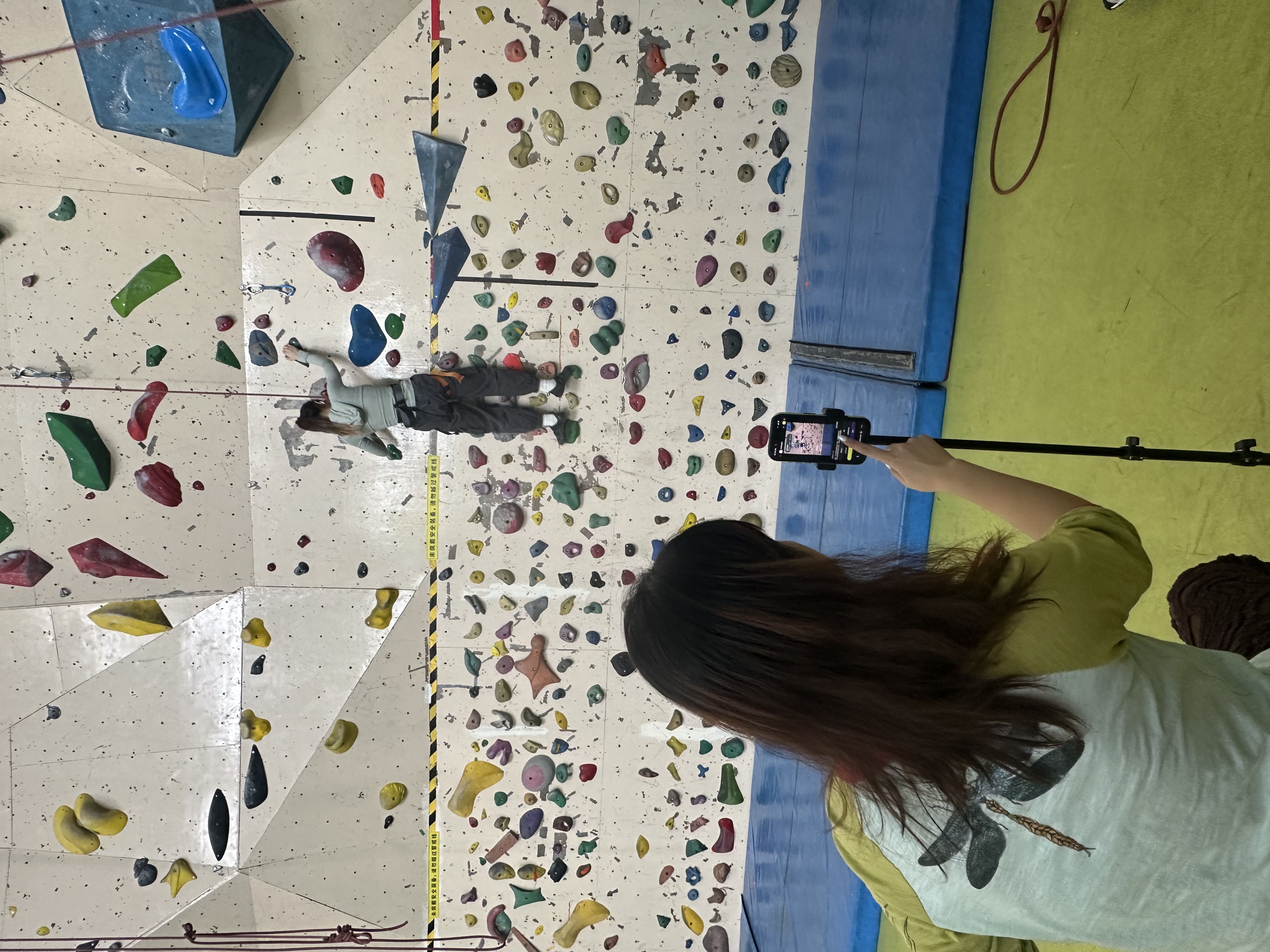
Our final testing setup brought together the key roles and equipment needed in a realistic climbing context: the participant, guide, tripod-mounted phone, and belayer support in a top-rope environment.
This was the most complete testing setup and gave us the clearest view of how HoldLight could operate in a real climbing session.
Design insight: This final setup provided the strongest evidence for evaluating route guidance in a realistic environment.
Participants received route information and then explained the route before climbing.
Participants climbed while receiving short audio cues such as "Right hand, two o'clock, far."
Participants used fallback controls when they were uncertain, missed a cue, or needed clarification.
In the controlled evaluation, participants experienced both a standardized current-practice human-support baseline and the HoldLight condition.
We measured four main aspects of the HoldLight workflow. The comparison values below summarize participant-level median results from the Phase C within-subjects evaluation with 12 BLV climbers.
Whether users could identify the start, finish, overall route direction, and key segment before climbing.
Uncertainty breakdown episodes, clarification-dependent interruptions, and repeat / more detail / pause / help actions.
Explicit human-help requests, extra information-support interventions, and system-to-human fallback events. This measures routine route-information support, not safety support.
Perceived autonomy, cue usefulness, uncertainty recovery, trust, safety, acceptability, and willingness to use the system again.
| Measure | Baseline | HoldLight | Interpretation |
|---|---|---|---|
| Route understanding score | 2.0 / 4 | 3.5 / 4 | Users built a clearer route model before climbing |
| Uncertainty breakdown episodes | 4.0 | 2.0 | Users got stuck less often |
| Clarification-dependent interruptions | 3.0 | 1.0 | Fewer stops for repeated explanation or clarification |
| Explicit human-help requests | 3.5 | 1.0 | Less routine dependence on human route prompts |
| Perceived autonomy | 3.0 / 5 | 5.0 / 5 | Users felt more in control |
Compared with the standardized baseline, HoldLight improved route-understanding score from 2.0 to 3.5 out of 4, reduced uncertainty breakdown episodes from 4.0 to 2.0, reduced clarification-dependent interruptions from 3.0 to 1.0, and reduced explicit human-help requests from 3.5 to 1.0. Perceived autonomy increased from 3.0 to 5.0 out of 5.
These results suggest that HoldLight did not mainly make users climb faster. Instead, it helped users build a clearer route model, recover from uncertainty more smoothly, and rely less on repeated human route prompts while keeping human safety support available.
These testing results directly informed the design refinements shown in the next section.
These refinements show how HoldLight changed after alpha testing, BLV user feedback, and real use observations. Instead of treating evaluation as a final check, we used feedback to simplify the interface, reduce cognitive load during guidance, and make route correction more efficient. Each Before / After case connects a user-observed problem to a concrete design change in the final prototype.
During team testing, classmates could understand the general idea of HoldLight, but they needed a clearer first action. The early interface contained too many competing entry points, and the scan function was not visually dominant enough for a mobile-first climbing workflow.
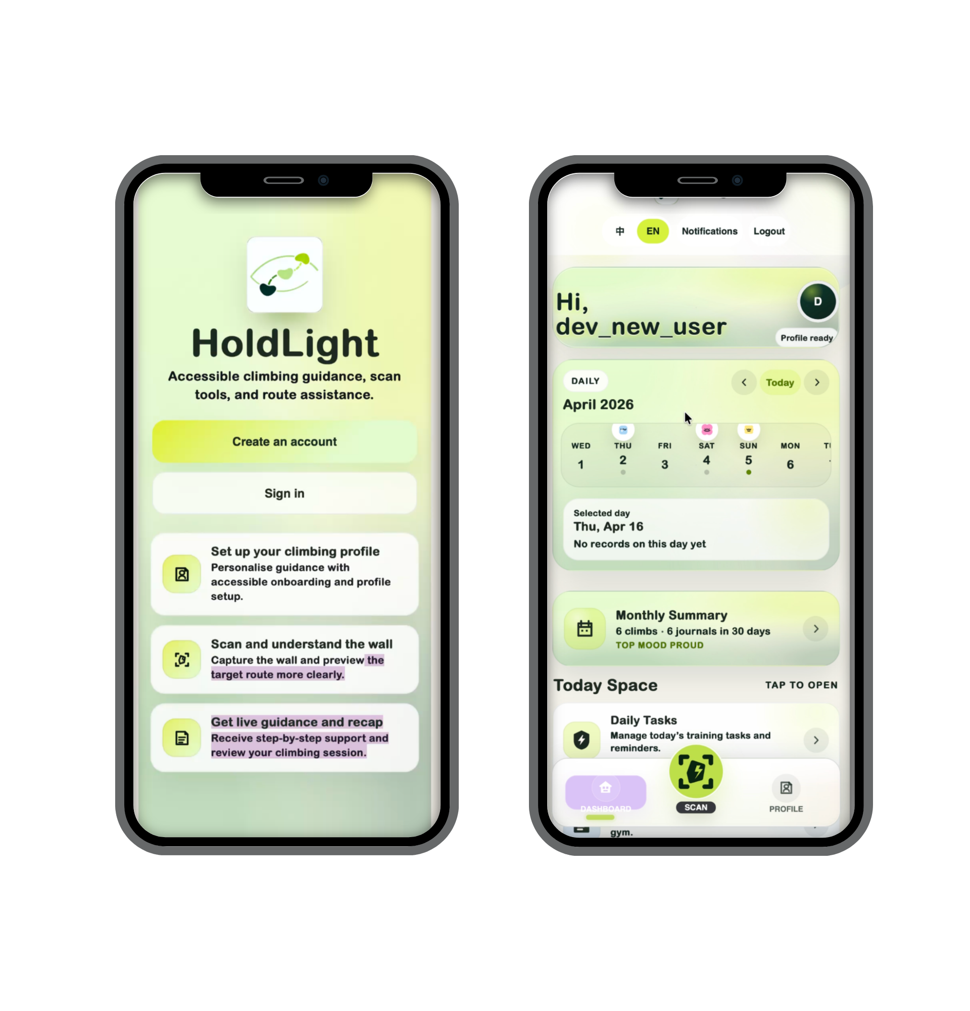
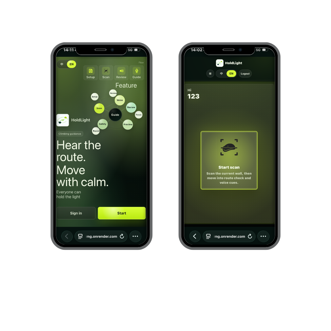
The early system looked more like a collection of features than a guided accessibility workflow. Users needed to spend extra time figuring out where to start, especially before the wall scan step. This created unnecessary friction before the core route preview experience.
We simplified the overall system structure and made wall scanning a more obvious primary action. The final flow gives stronger visual priority to scan-related actions, reduces unnecessary interface clutter, and makes the route setup process easier to follow.
This change makes the system easier to enter and better supports the first stage of HoldLight: capturing the climbing wall before route preview. It also aligns with mobile-first use in a climbing gym, where users need quick, clear, and low-friction interaction rather than a dense feature menu.
During BLV user testing, detailed in-climb instructions were found to be difficult to process while the climber was already moving or holding body weight on the wall. Users needed cues that were short, consistent, and immediately actionable.
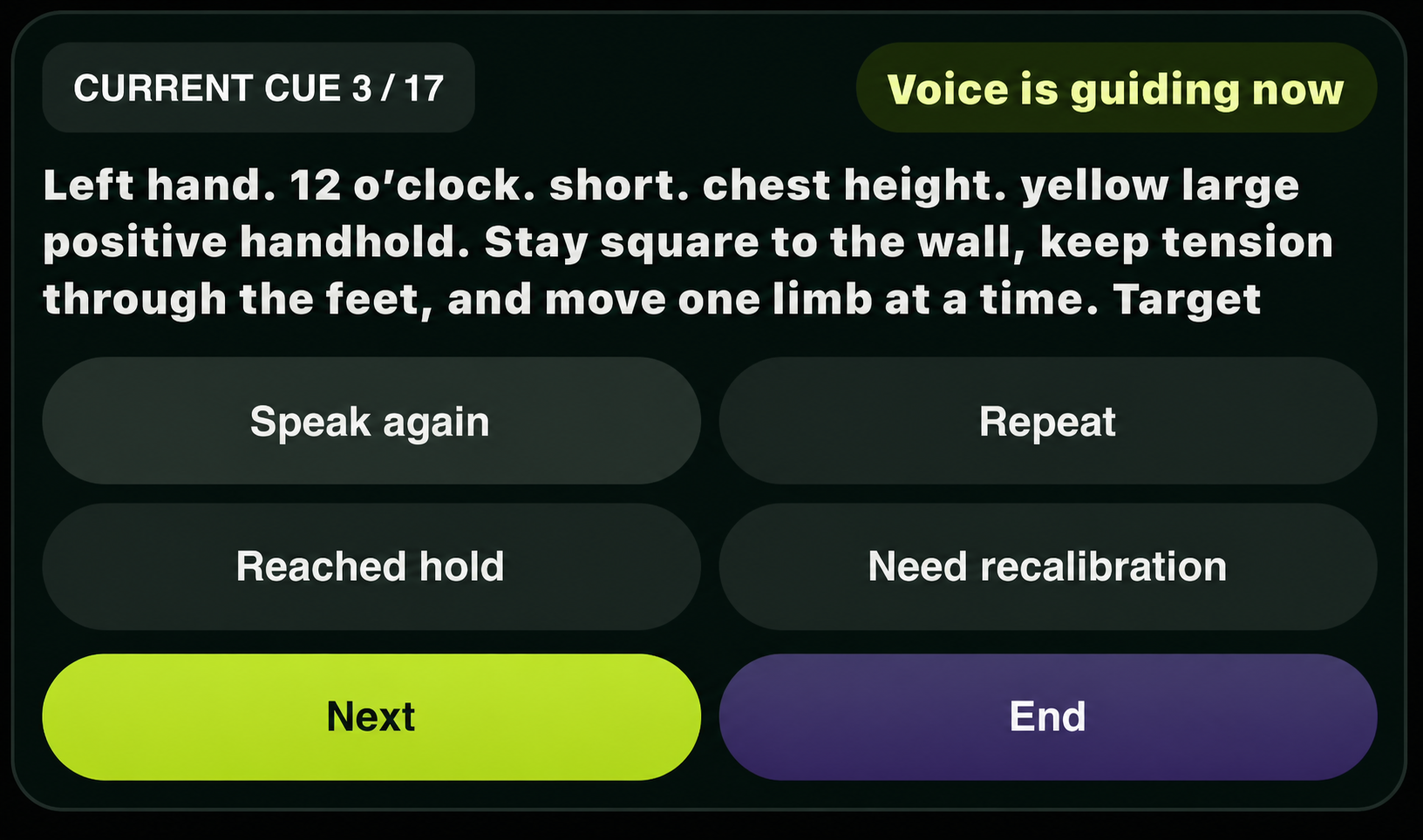
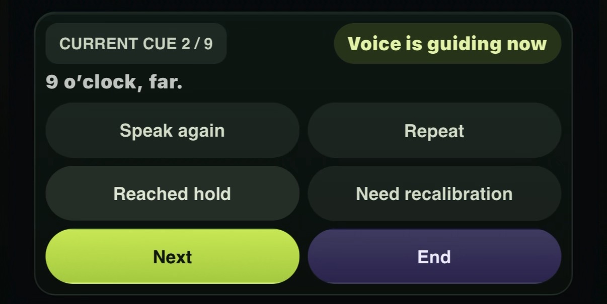
The earlier guidance style used longer descriptive prompts. Although these prompts contained more information, they could slow down the climber’s decision-making, interrupt rhythm, and increase cognitive load during movement.
We changed the in-climb audio guidance to a brief direction-first format. Instead of long sentences, cues focus on the body part, direction, and distance, such as “Right hand, two o’clock, far.” More detail can still be requested when needed, but the default cue remains short.
This change makes the guidance easier to act on during climbing and reduces cognitive load. It supports HoldLight’s core design principle: give enough information for action without turning the climber into a passive follower.
In route correction testing, users found that adding or deleting detected holds one by one was too slow, especially when the scan result contained multiple incorrect or missing holds. This made the correction process feel repetitive and inefficient.
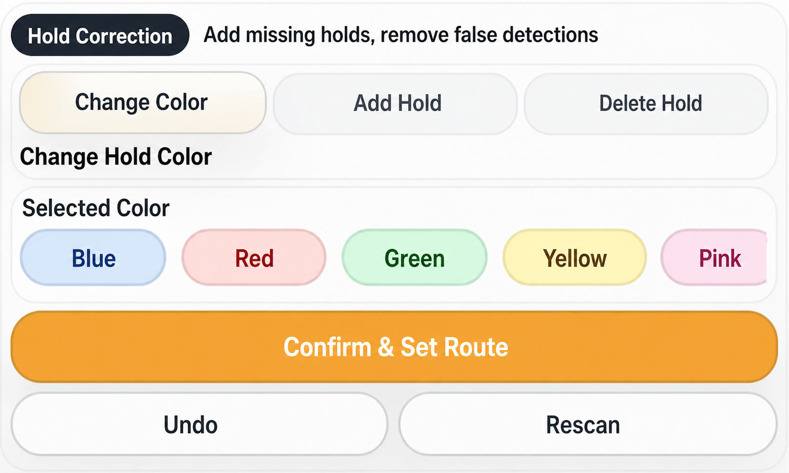
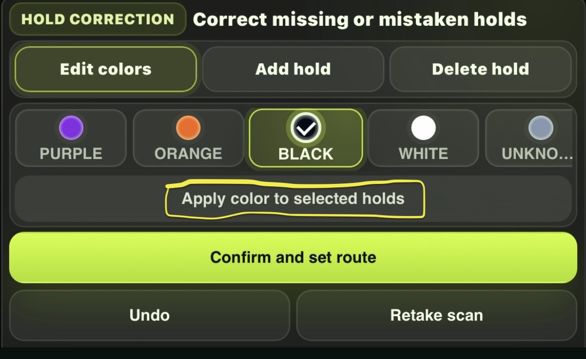
The earlier manual correction flow required users to edit holds individually. This created unnecessary interaction cost before route preview and made the system less practical for real climbing gym use, where lighting, hold density, and wall complexity can cause multiple detection errors at once.
We added batch editing controls for hold correction. Users can now select multiple holds and delete them together, or add and adjust holds more efficiently through a dedicated batch action. The individual editing option remains available for precise correction, but users are no longer forced to repeat the same action one hold at a time.
This refinement makes the wall scan correction workflow faster and more realistic for actual use. It also improves the reliability of later route preview and audio guidance because users can clean up the route representation more efficiently before starting the climb.
These Before / After refinements show that HoldLight’s design process was not only about improving visual polish. The main changes came from human-centered evaluation: simplifying the interface after team testing, shortening audio cues to reduce cognitive load, and improving batch hold editing after real workflow testing. Together, these changes support a more accessible and practical climbing experience.
The final design balances autonomy and safety. HoldLight does not replace coaches, guides, or belayers. Instead, it reduces routine information-support burden while keeping human help available for uncertain or safety-critical moments. This is important ethically because an accessibility system for climbing should not hide uncertainty or encourage over-trust in automation. Users should remain in control, understand when the system is uncertain, and be able to request human support when needed.
AI tools were used to support visual refinement, wording, and coding assistance, but the core design logic, testing findings, and human-centered decisions came from our group’s research and evaluation. AI-generated suggestions were checked against our user requirements, accessibility goals, and actual testing feedback before being used in the final portfolio or system.
HoldLight began from a simple recognition: indoor climbing is still organised around visual certainty. Route preview, hold identification, and movement planning are usually assumed to be seen before they are acted on. For blind and low-vision climbers, this creates an informational barrier as much as a physical one, limiting access to confidence, independence, and belonging within the activity.
Ethically, the question was not how to deliver the most guidance, but how to support the climber without displacing agency or overstating what the system could reliably know. In a climbing context, guidance that is too dense, too continuous, or too certain can interrupt rhythm, increase cognitive load, and imply a level of safety assurance that technology alone cannot guarantee.
The current prototype remains an early implementation. Route recognition requires further real-gym validation, camera framing still depends partly on assistant support, and audio cue comprehension may vary in noisy climbing environments. The project should not be treated as a complete safety system.
Future development should include longer-term testing with more diverse blind and low-vision climbers in less controlled gym contexts, stronger uncertainty handling, more robust vision evaluation, haptic feedback exploration, and deeper integration with climbing gym workflows.
I used a combination of AI tools and design resource platforms across research, visual exploration, prototyping, and front-end implementation. Each tool supported a different stage of the workflow, while the final design decisions were still reviewed manually based on accessibility, consistency, and project requirements.


I used ChatGPT to structure early ideas, summarize the UI logic, organize the front-end framework, and turn rough design thoughts into clearer prompts and implementation instructions.
AI helped me quickly explore different UI styles, color palettes, and layout directions before building the final interface.
Text-based AI helped me turn rough design ideas into structured prompts and front-end instructions, which made it easier to communicate with coding tools.
Google AI Studio and Codex helped me quickly generate and refine early UI prototypes, especially for page structure and navigation flow.
The workflow allowed me to test multiple design directions and improve the interface step by step.
Some generated interfaces looked good visually but did not fully consider low-vision readability, contrast, spacing, or simple interaction.
AI could generate pages quickly, but the actual transition logic between screens still needed careful human checking.
Different AI outputs sometimes used different spacing, colors, or component styles, so I had to manually unify the UI system.
AI was useful for assistance, but final decisions still needed to be based on project requirements, accessibility needs, and group discussion.
UI DESIGN TIMELINE
I explored existing apps such as Keep and other sports products to understand common functions, layout patterns, and user flow structures.
After collecting references, I discussed the possible features with my group members and helped decide which functions should be included in the product.
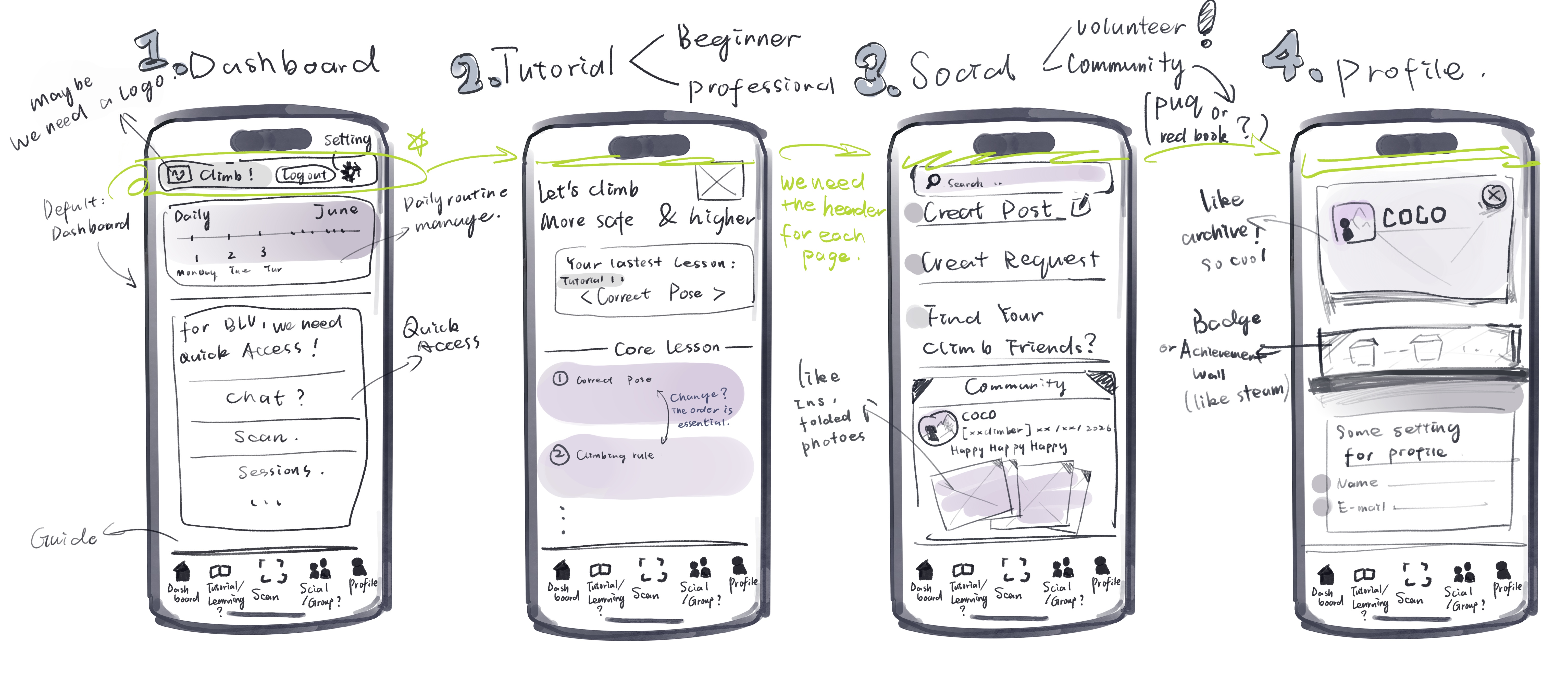
I created hand-drawn sketches to map key UI screens and the transition logic between them before moving into digital prototyping.
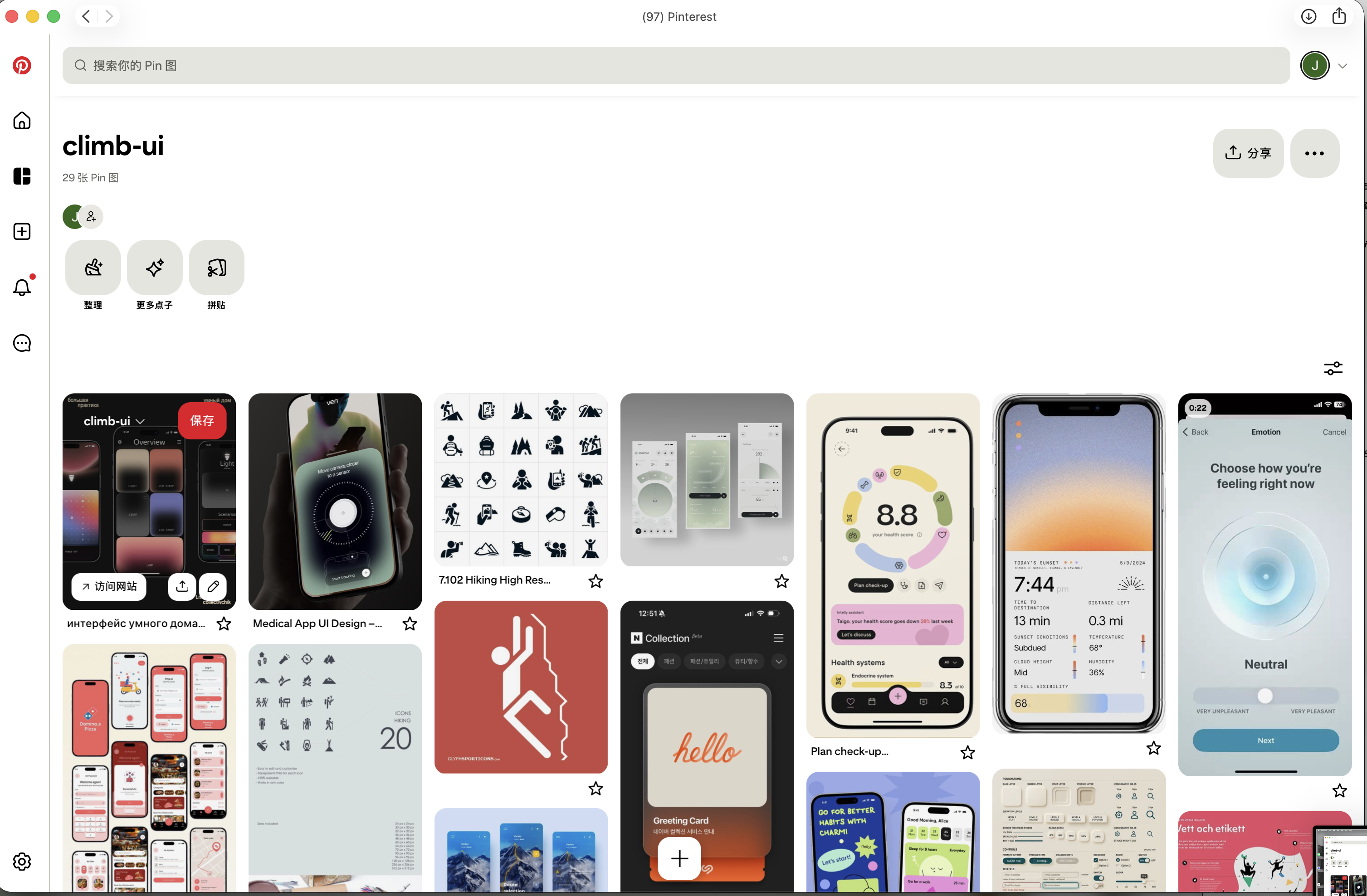
I searched for sports app interfaces and design references, then compared them with our sketches to preview the possible visual direction.
I used image-based AI to summarize the visual style, color palette, and interaction mood that best matched our project direction.
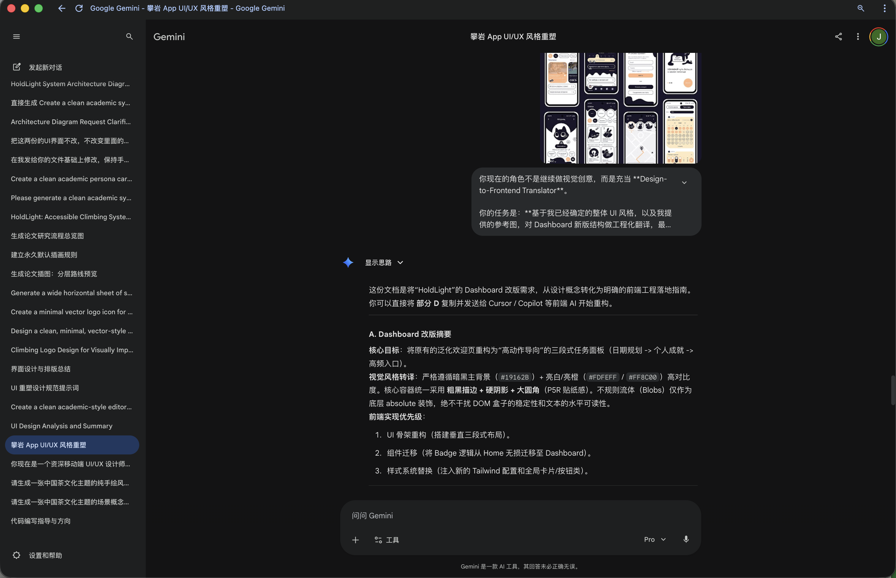
I used text-based AI to organize the page structure, layout logic, and navigation flow into clearer design instructions for implementation.
Based on the chosen style direction, I generated an early front-end prototype in Google AI Studio and exported the initial zip package.
Finally, I used Codex to improve component consistency, page transitions, and the interaction logic, turning the early prototype into a more complete front-end result.
 01
01
 02
02
 03
03
 04
04
 05
05
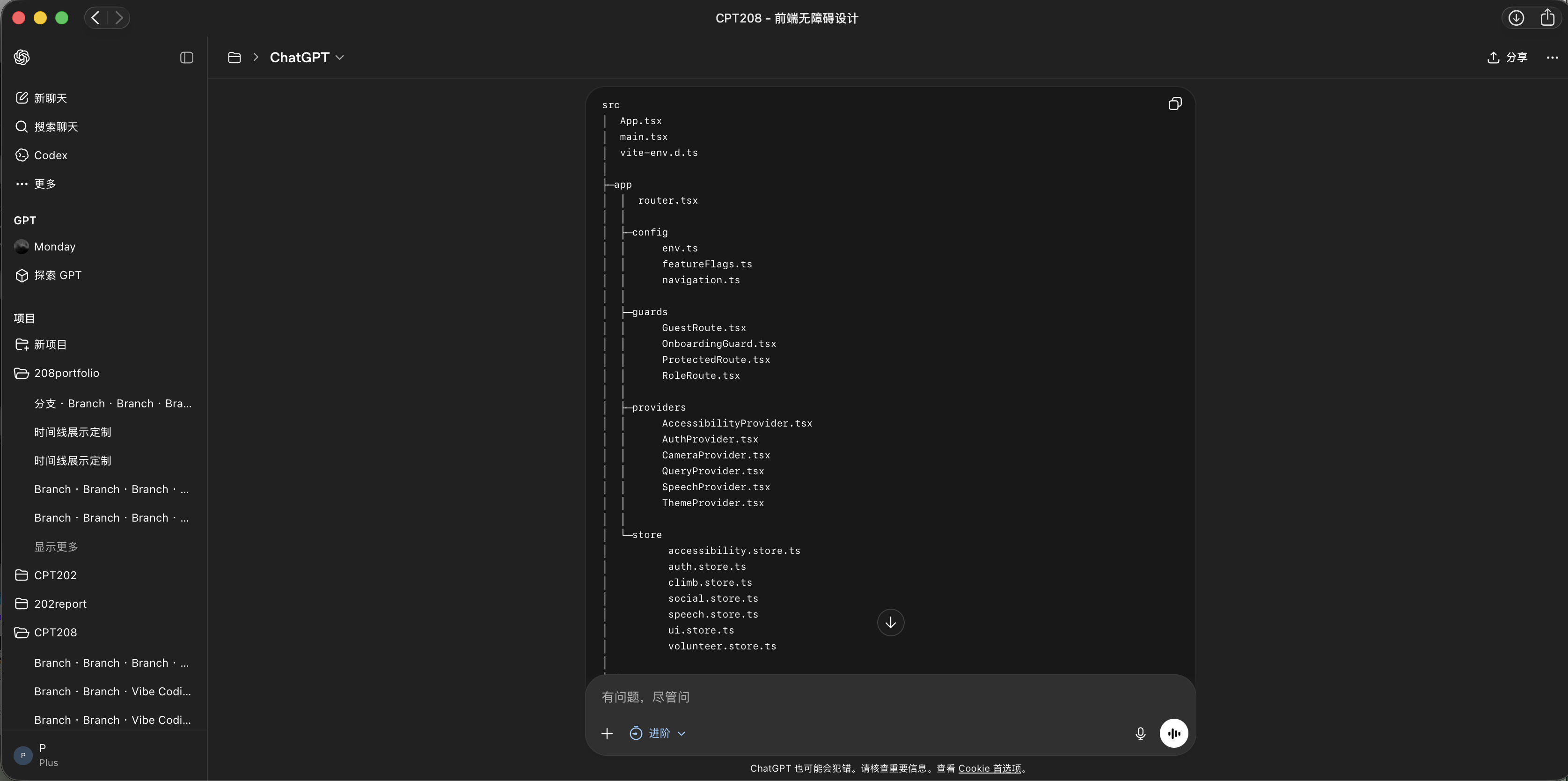 06
06
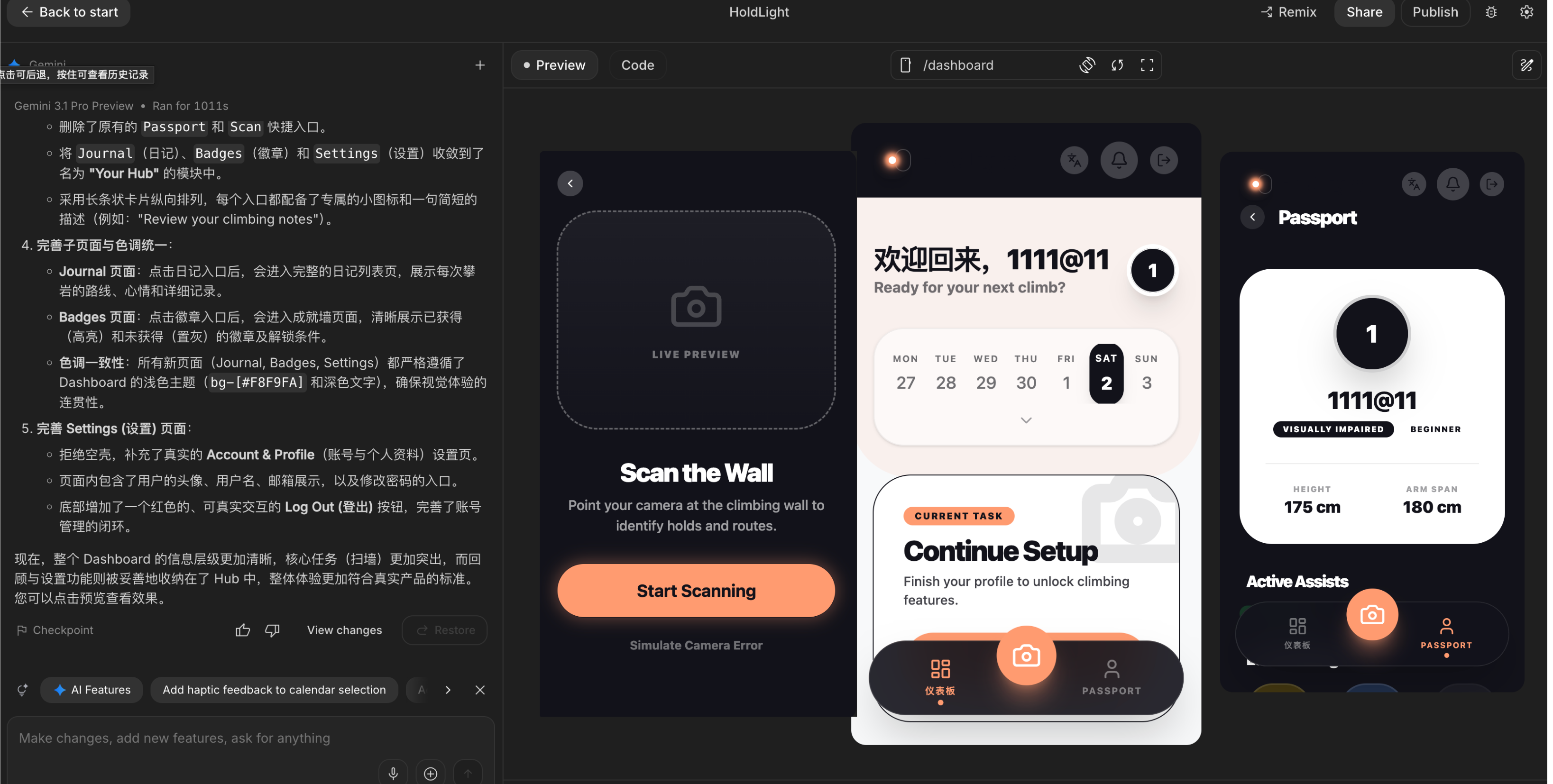 07
07
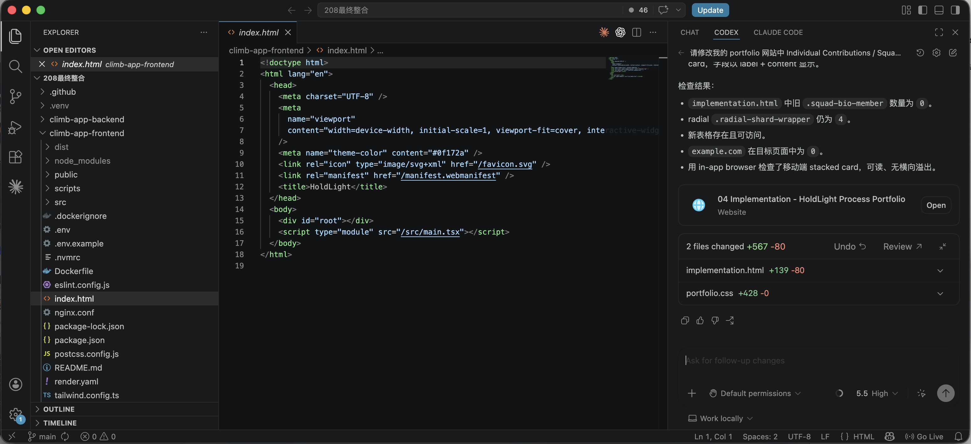 08
08
During system and portfolio development, we used AI as a coding, layout, and debugging assistant. However, HoldLight’s core design logic, user research findings, requirement analysis, and human-centred justification came from our group’s own research, testing, and iterative refinement. AI outputs were treated as drafts, not final evidence.
P — Prompt: We asked AI to help scaffold a mobile-first route preview interface for HoldLight, using an Overview → Segment → Drill-down structure and clear route information hierarchy.
O — Outcome: The AI suggested a card-based preview structure. This helped us quickly explore layout directions, but the first output was too generic, too visually focused, and contained too much text for a pre-climb context.
A — Action: We kept the layered structure, but manually reduced text, reorganised information into direction-first and segment-first cues, and adjusted spacing, button hierarchy, and mobile readability.
V — Verification: We checked the revised UI against our requirement that route preview should help climbers understand the route before climbing. We also reviewed the flow through manual mobile walkthroughs and before/after refinement evidence.
E — Ethics / Accessibility: Because HoldLight supports blind and low-vision climbers, we avoided presenting AI-generated route guidance as fully certain. We preserved fallback and help options when information may be unclear.
P — Prompt: We asked AI to support the design of accessibility controls, including repeat, pause, more detail, help, high-contrast settings, and simplified voice-guidance interactions.
O — Outcome: The AI provided a useful starting structure for control buttons and interaction states. However, the first version looked like a generic app panel and did not fully address BLV safety, touch target size, or unclear low-confidence situations.
A — Action: We manually enlarged key controls, clarified button labels, reduced icon-only communication, improved contrast, and kept explicit fallback actions such as repeat cue, request more detail, pause guidance, and ask for human help.
V — Verification: We checked these controls against our requirements for brief audio cues and recoverable interaction. We also reviewed whether users could access key actions without relying on dense visual information.
E — Ethics / Accessibility: For BLV climbers, incorrect or overconfident guidance may create safety risks. Therefore, AI-generated code and wording were not accepted directly; they were revised to prioritise clarity, predictability, and recoverability.
Representative AI-assisted prompts are documented in the project repository’s /ai-logs folder. These logs record the prompt, intended task, AI outcome, team modification, verification method, and accessibility / ethics notes for each major AI-assisted task.
If links do not open in the deployed site, the same files are available in the repository under /ai-logs.
Our final approach was human-led and AI-assisted: AI helped accelerate coding, layout exploration, and debugging, while final design decisions were judged against user needs, accessibility requirements, and HoldLight’s evaluation findings.
AI helped me prototype faster, but the final design still needed to be guided by accessibility, safety, and real user needs.
Because this project supports blind and low-vision climbers, the UI could not only look visually polished. I needed to manually check readability, contrast, spacing, speech feedback, and simplified interaction.
AI and computer vision should not replace human safety support in climbing. The system should provide guidance and fallback messages, while real climbing safety still depends on human supervision and careful judgement.
I used AI for visual exploration, layout planning, and front-end iteration, but I did not treat AI output as final. Some AI-generated designs looked good but were not accessible enough, so I reviewed and adjusted them based on project goals and user-centered design principles.
Overall, vibe coding improved my design speed, but the final decisions were still made through human judgement, group discussion, accessibility review, and testing.
Current portfolio images use local project assets and placeholders. If image generation tools are used later, generated assets and prompts should be documented in the references or AI logs.