Early Ideation

We began with rapid sketching to explore how HoldLight could support route scanning, beginner learning, assistant support, voice interaction, and mobile-first climbing guidance.

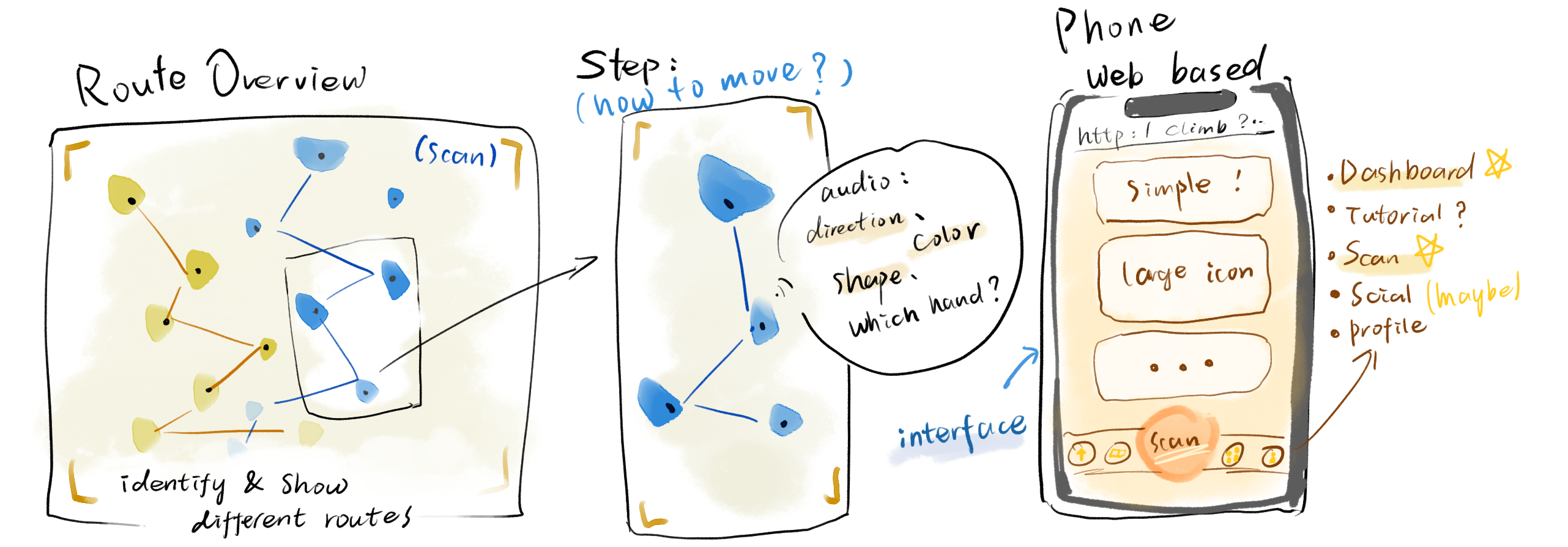
Crazy 8 sketch exploring HoldLight's early route scanning, climbing support, and mobile guidance ideas.
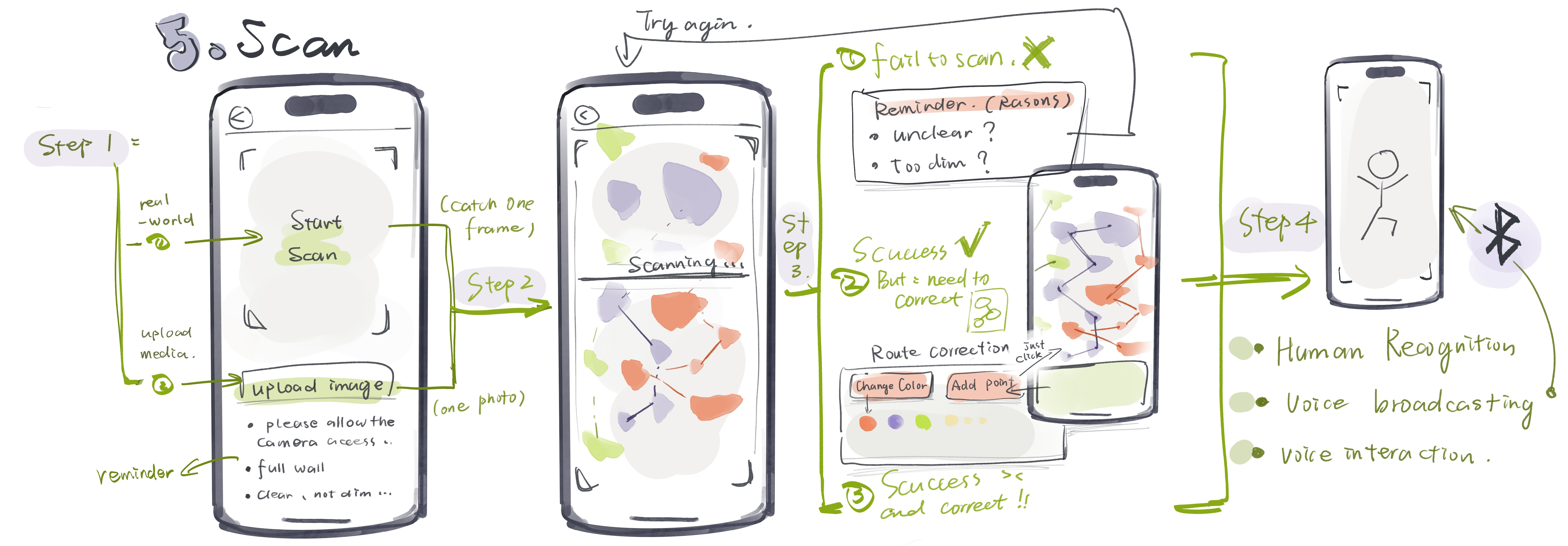
Crazy 8 sketch exploring HoldLight scan flow, upload image, scan success, scan fail, route correction, human recognition, voice broadcasting, and voice interaction.
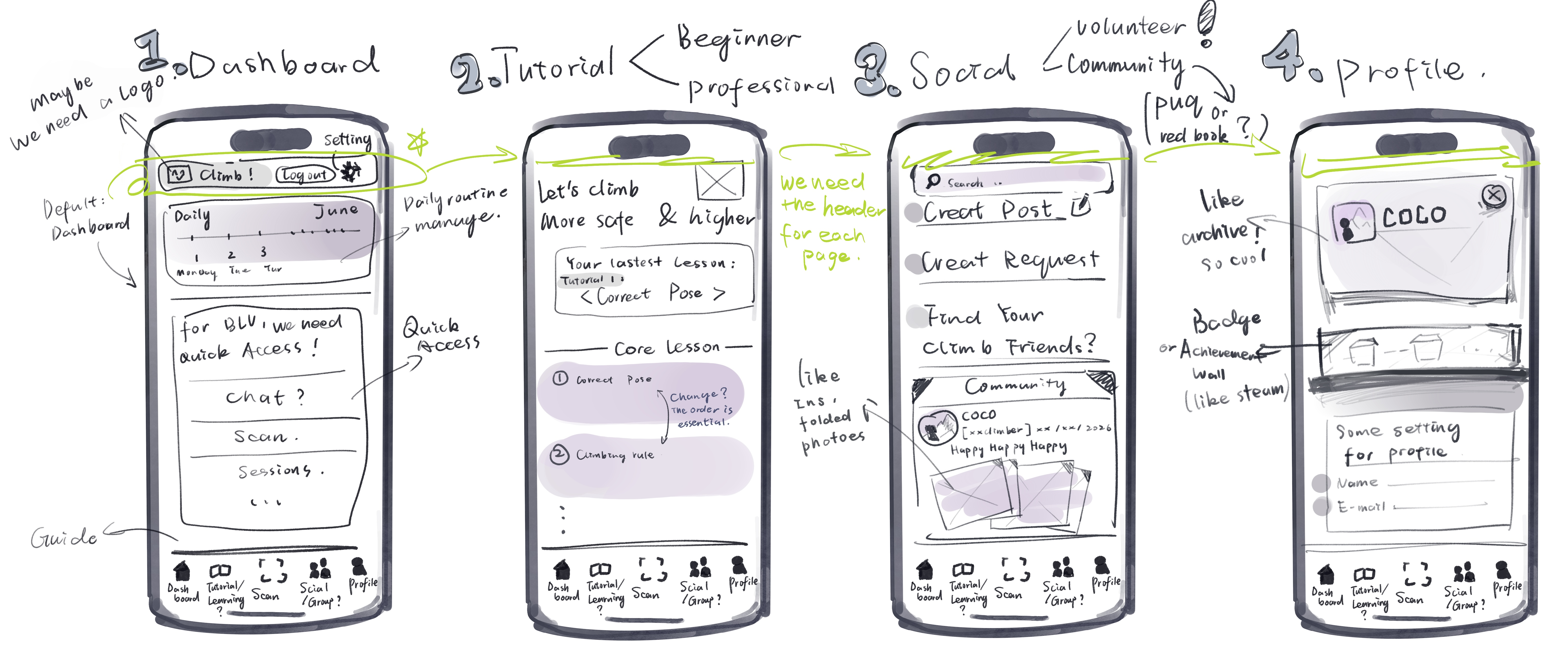
Crazy 8 sketch exploring dashboard, tutorial, social community, profile, quick access, page headers, bottom navigation, and guide structure.
Crazy 8 sketches. 8 rapid sketch ideas across three sheets cover app structure, scan flow, route correction, assistant support, voice output, and beginner guidance.

Prototype & Alternatives

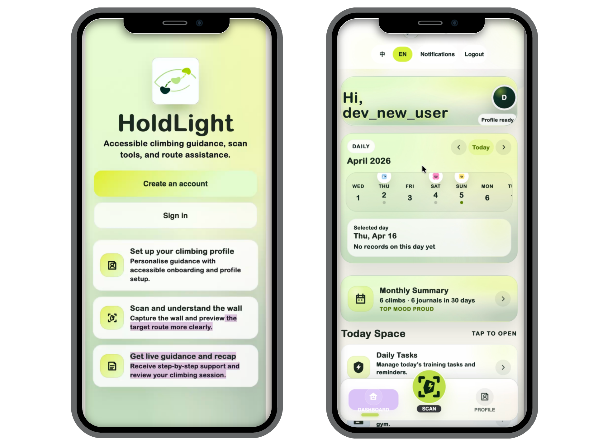
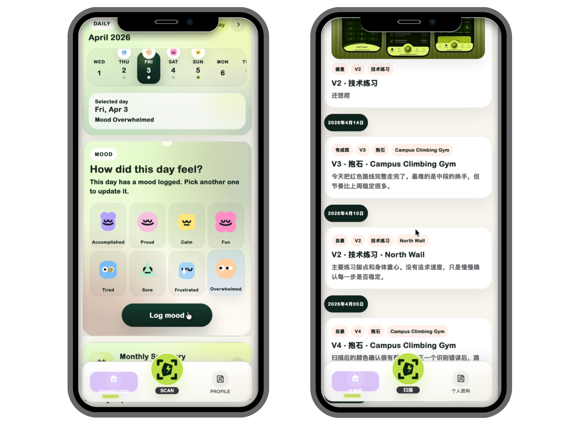
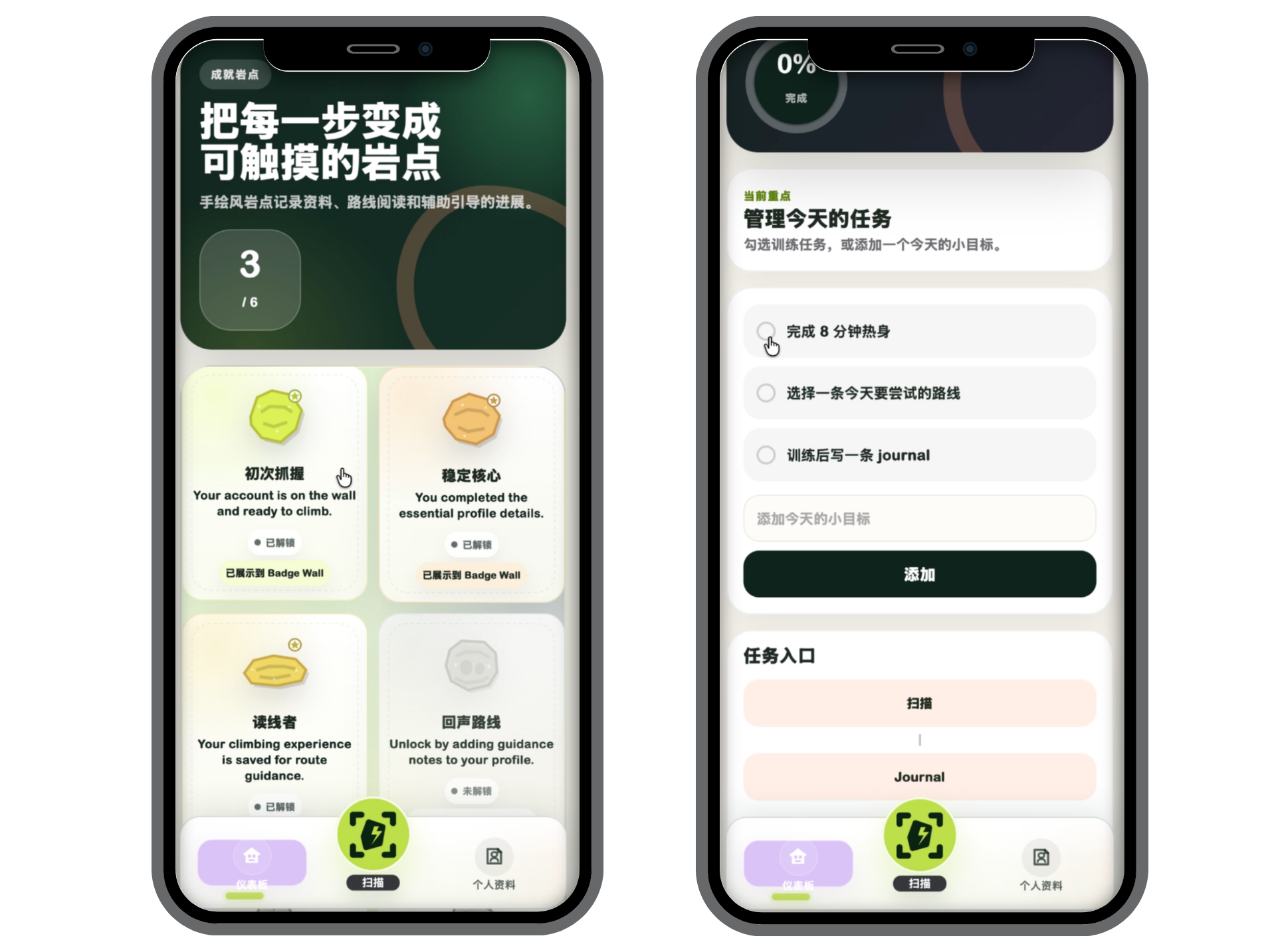
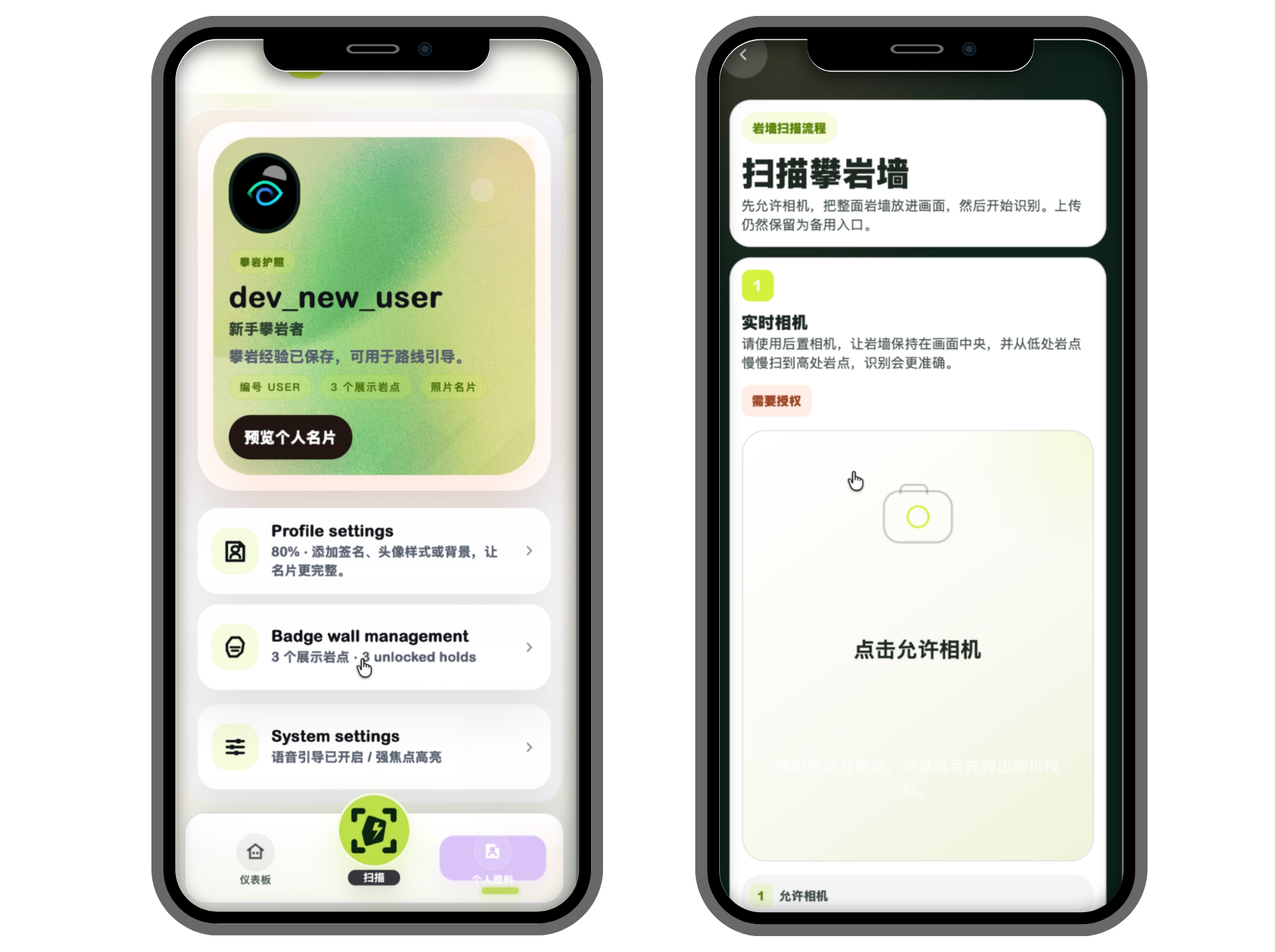
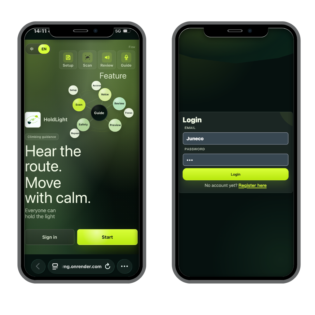
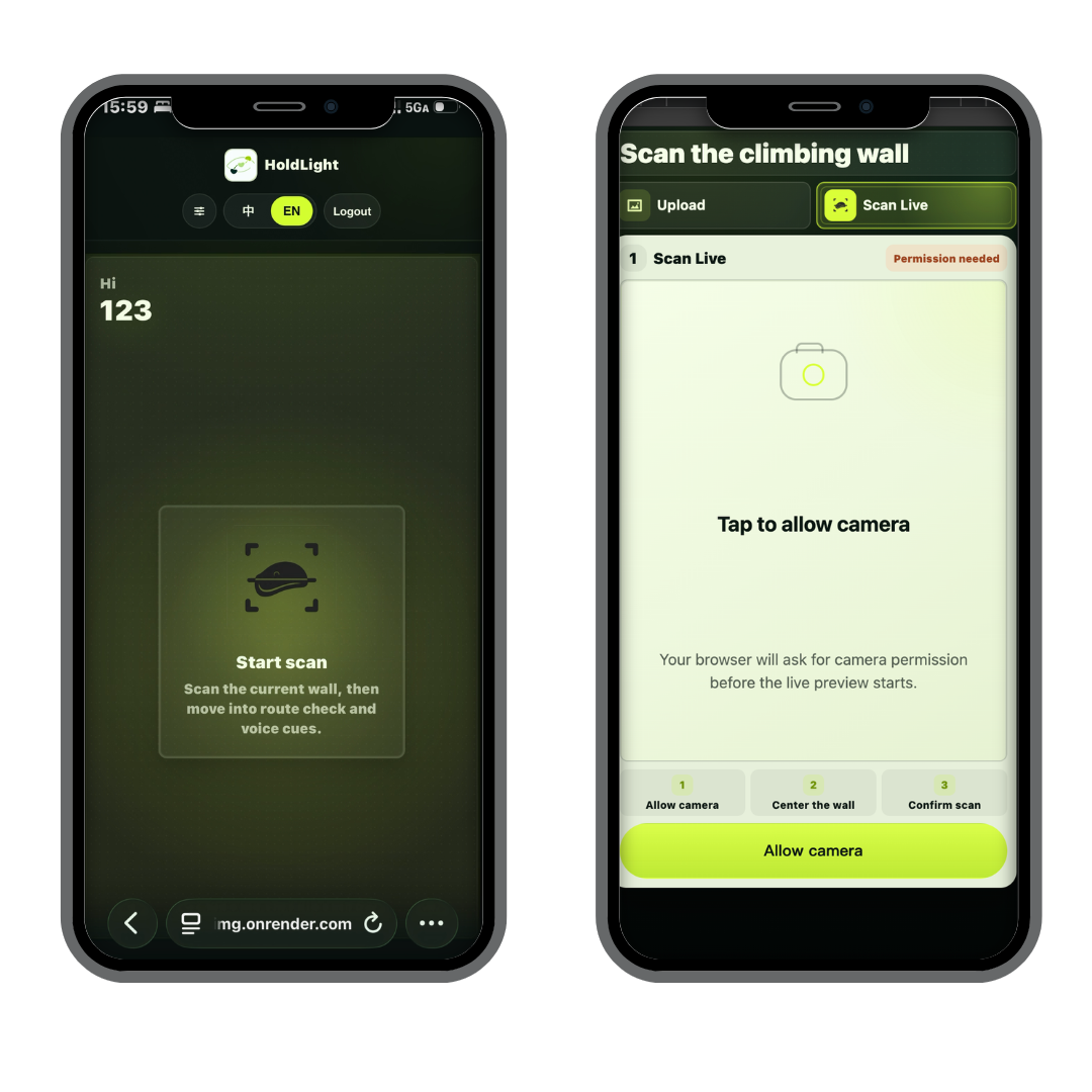
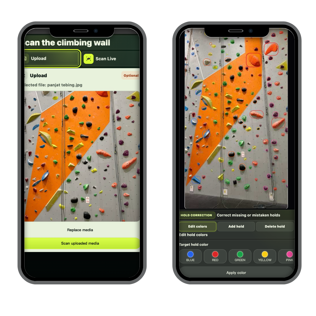
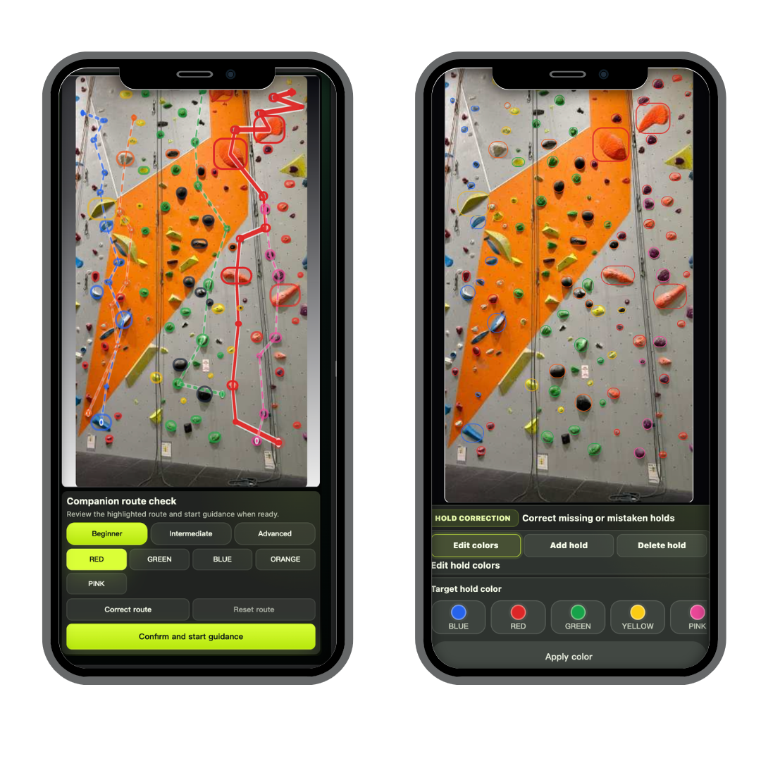
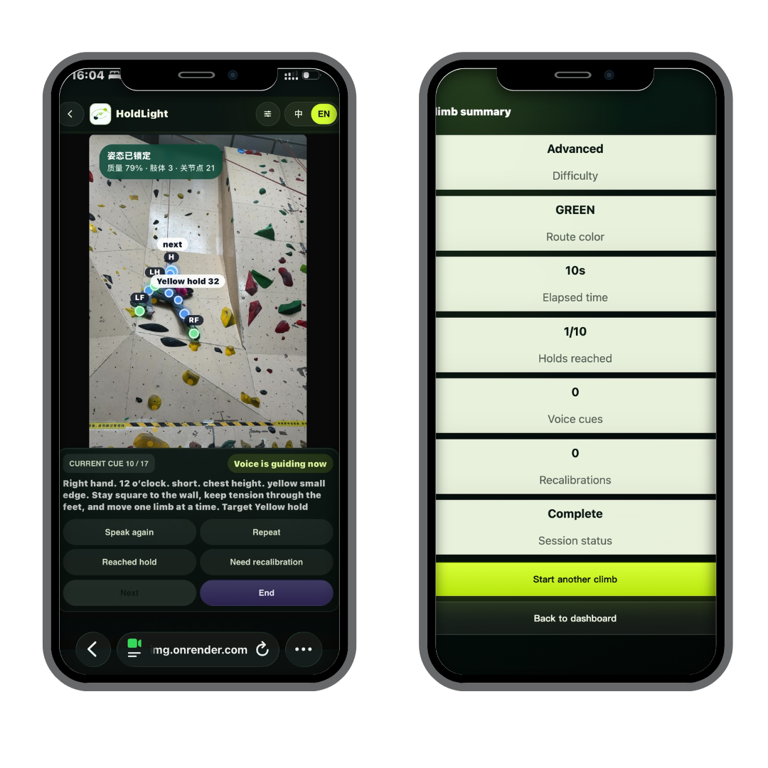
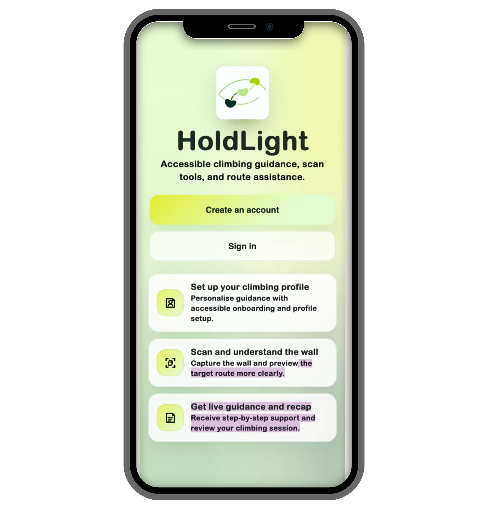
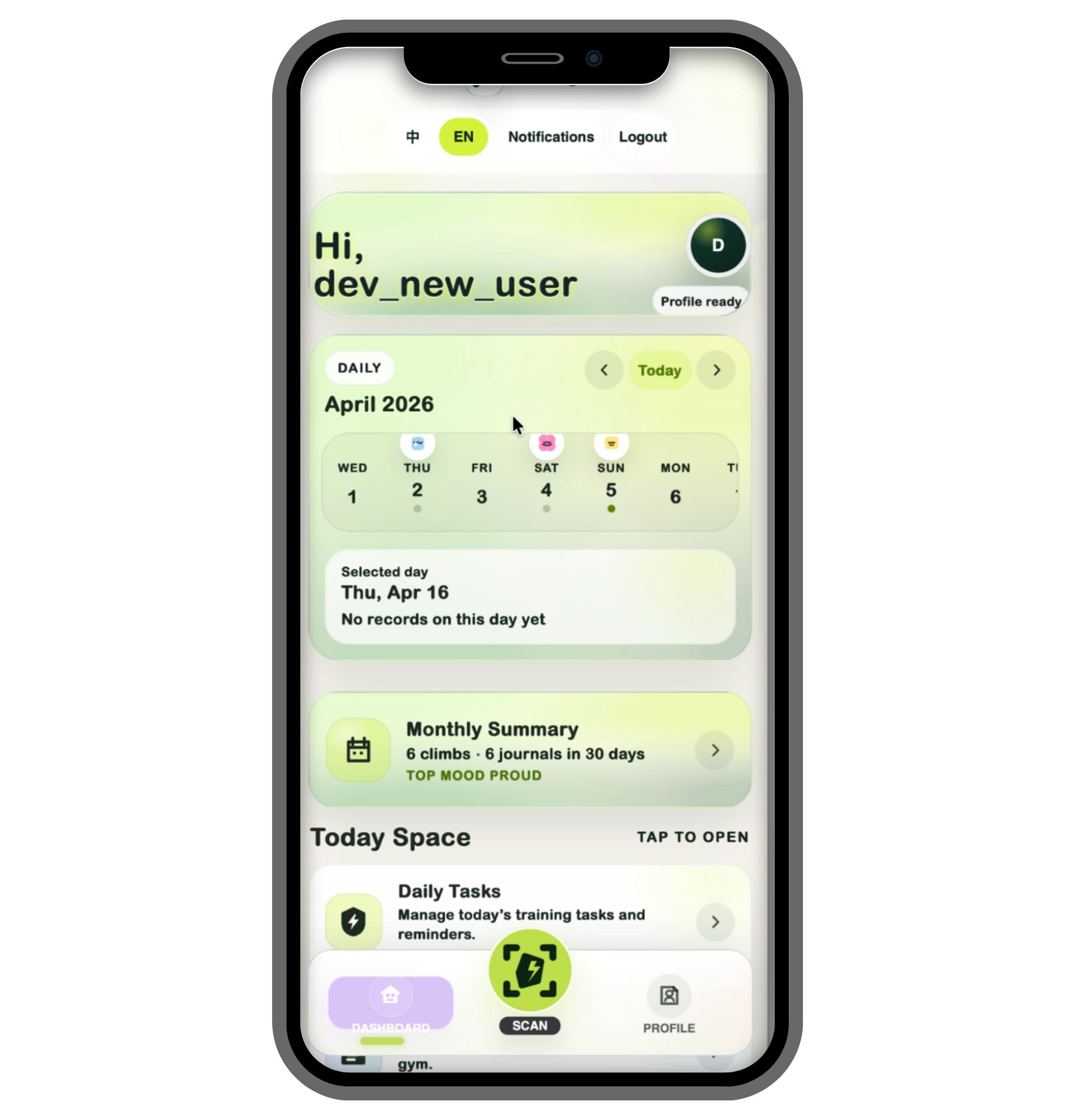
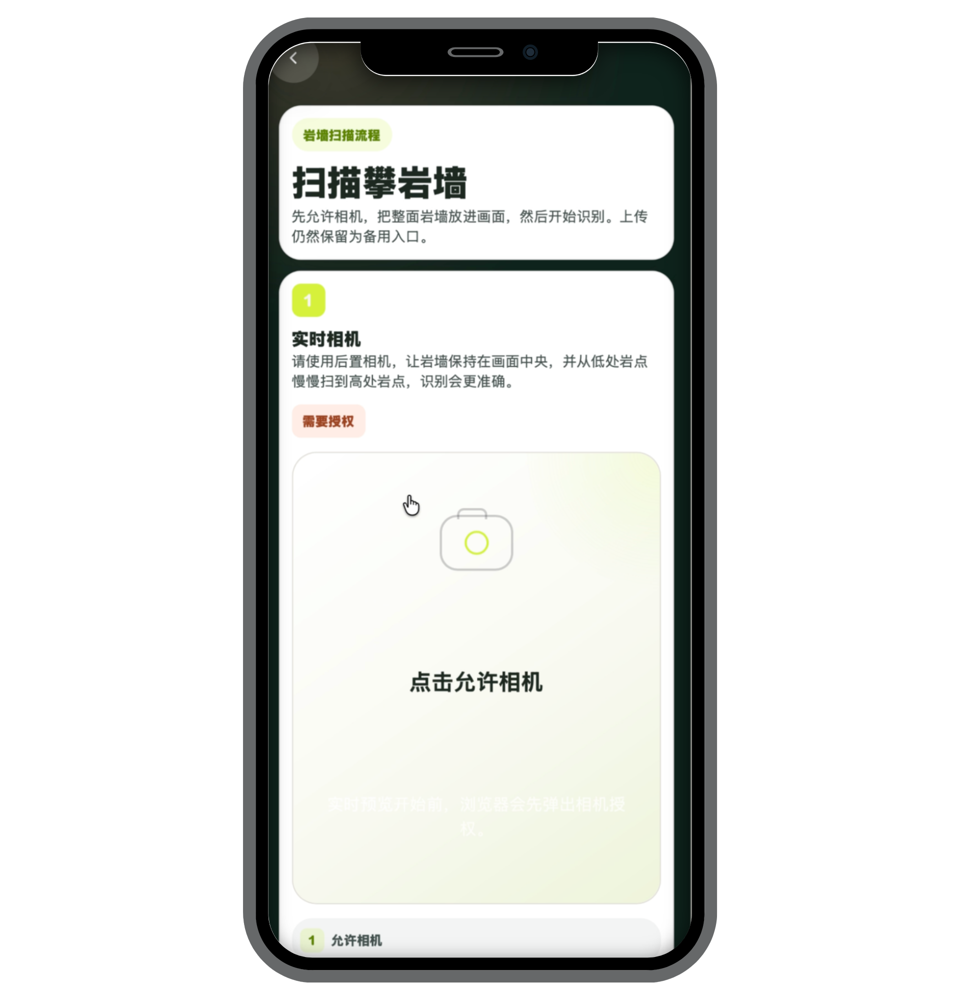
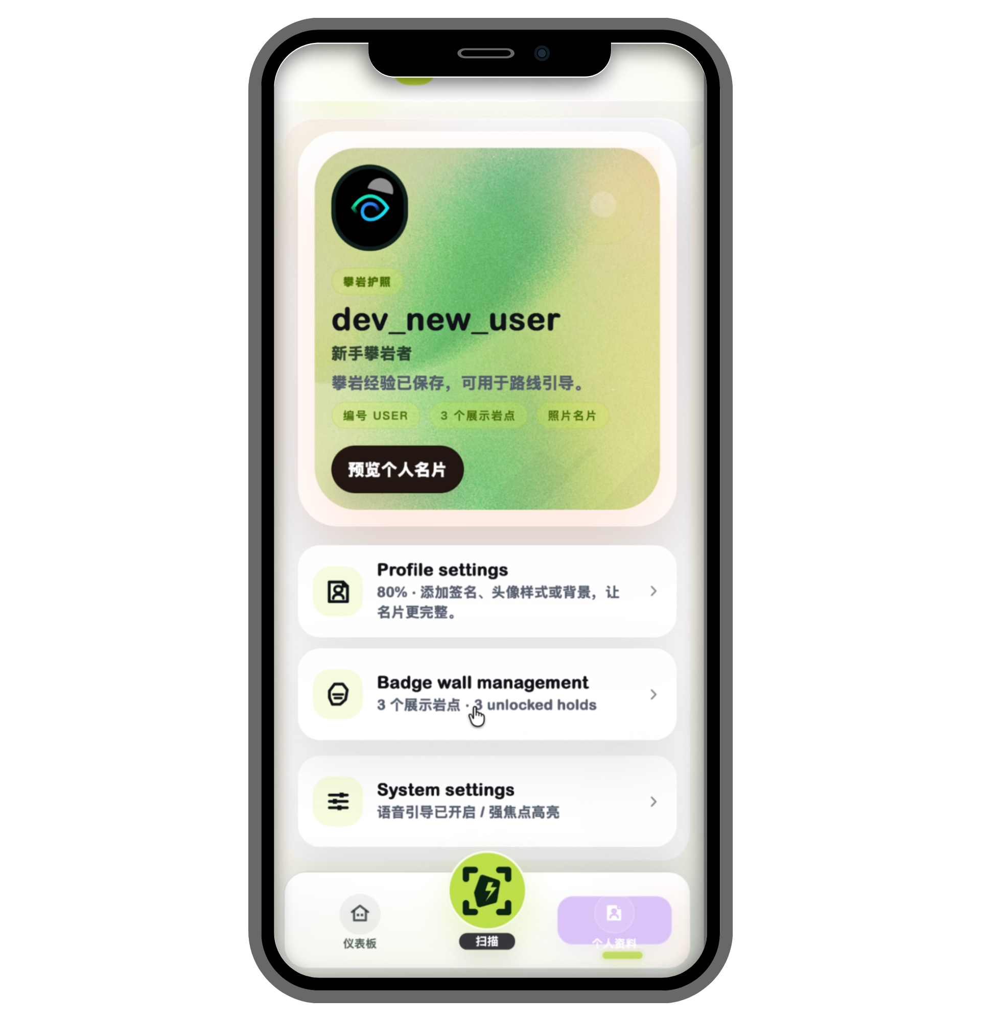
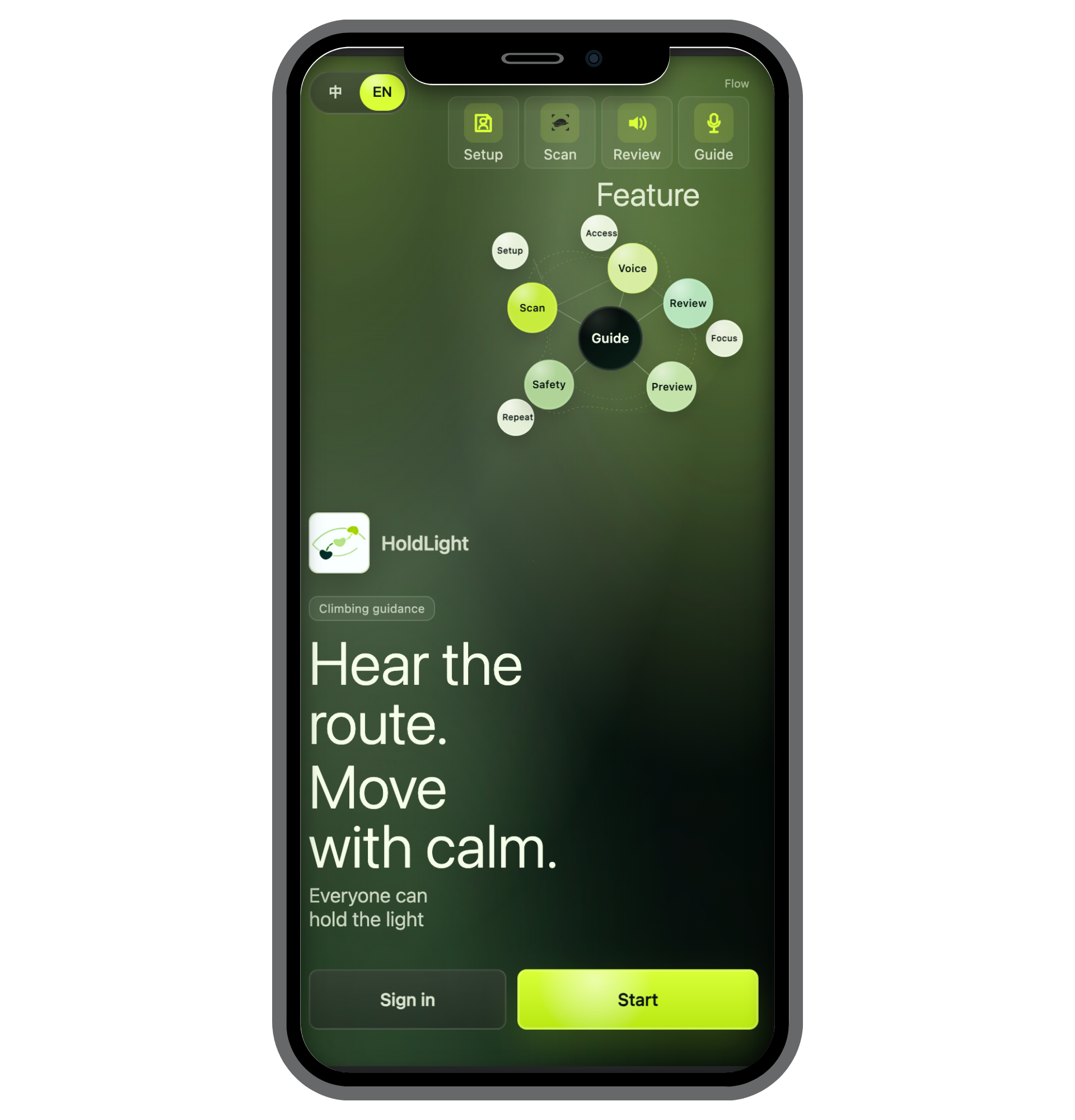
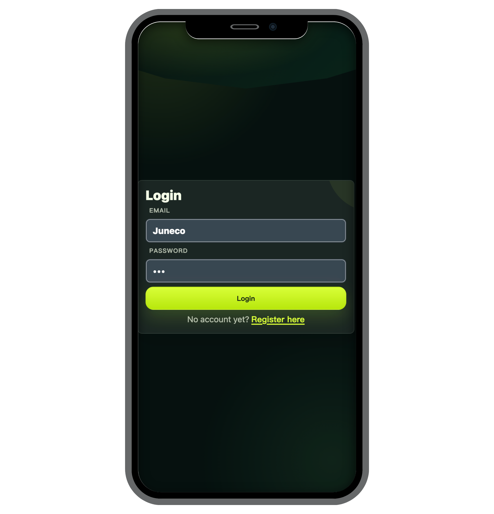
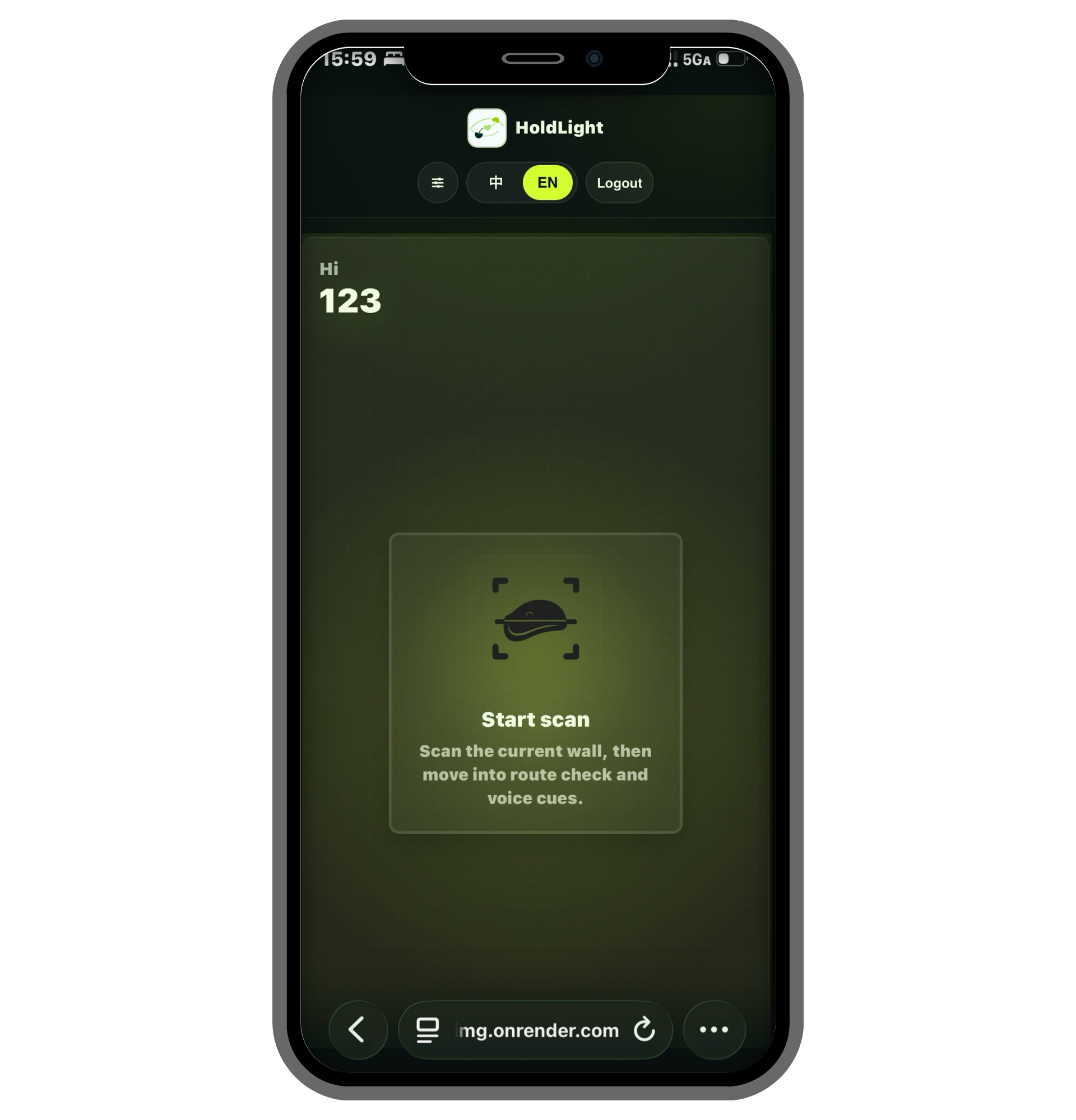
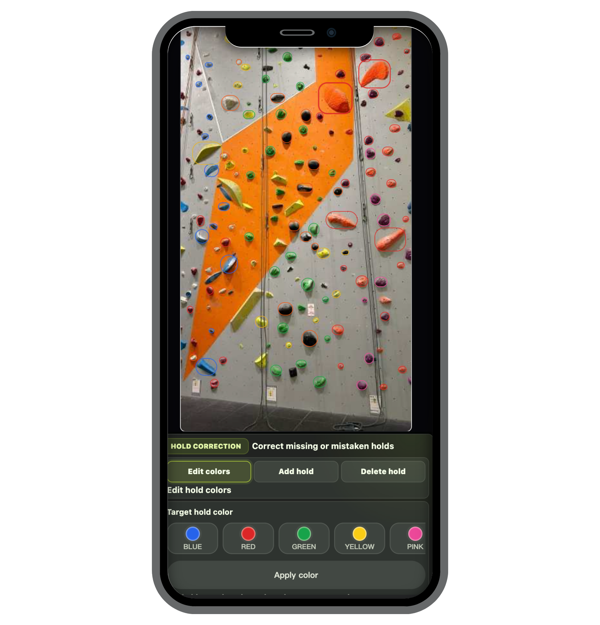
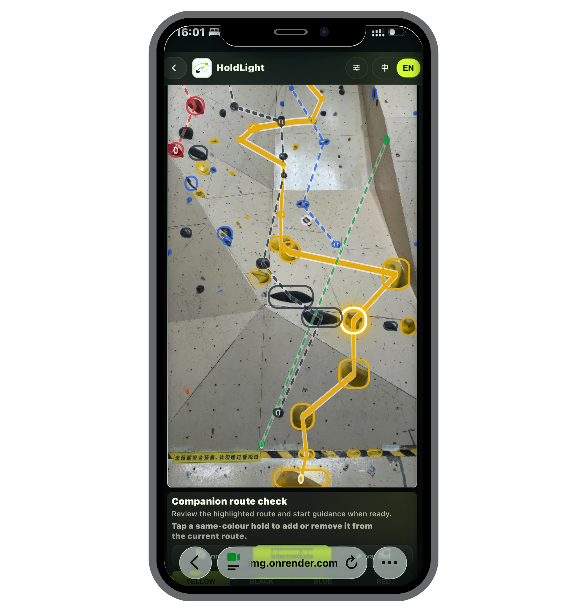
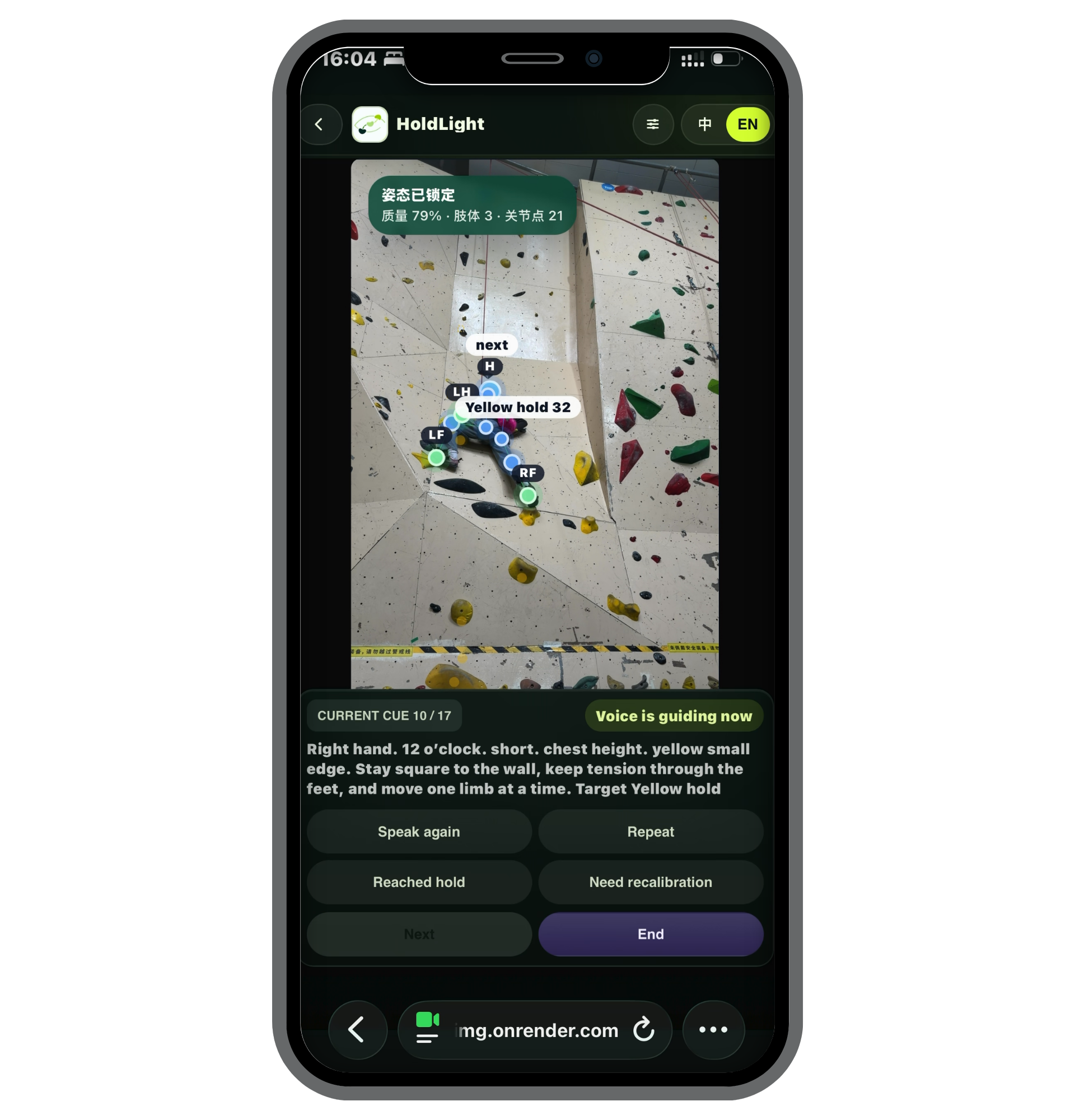
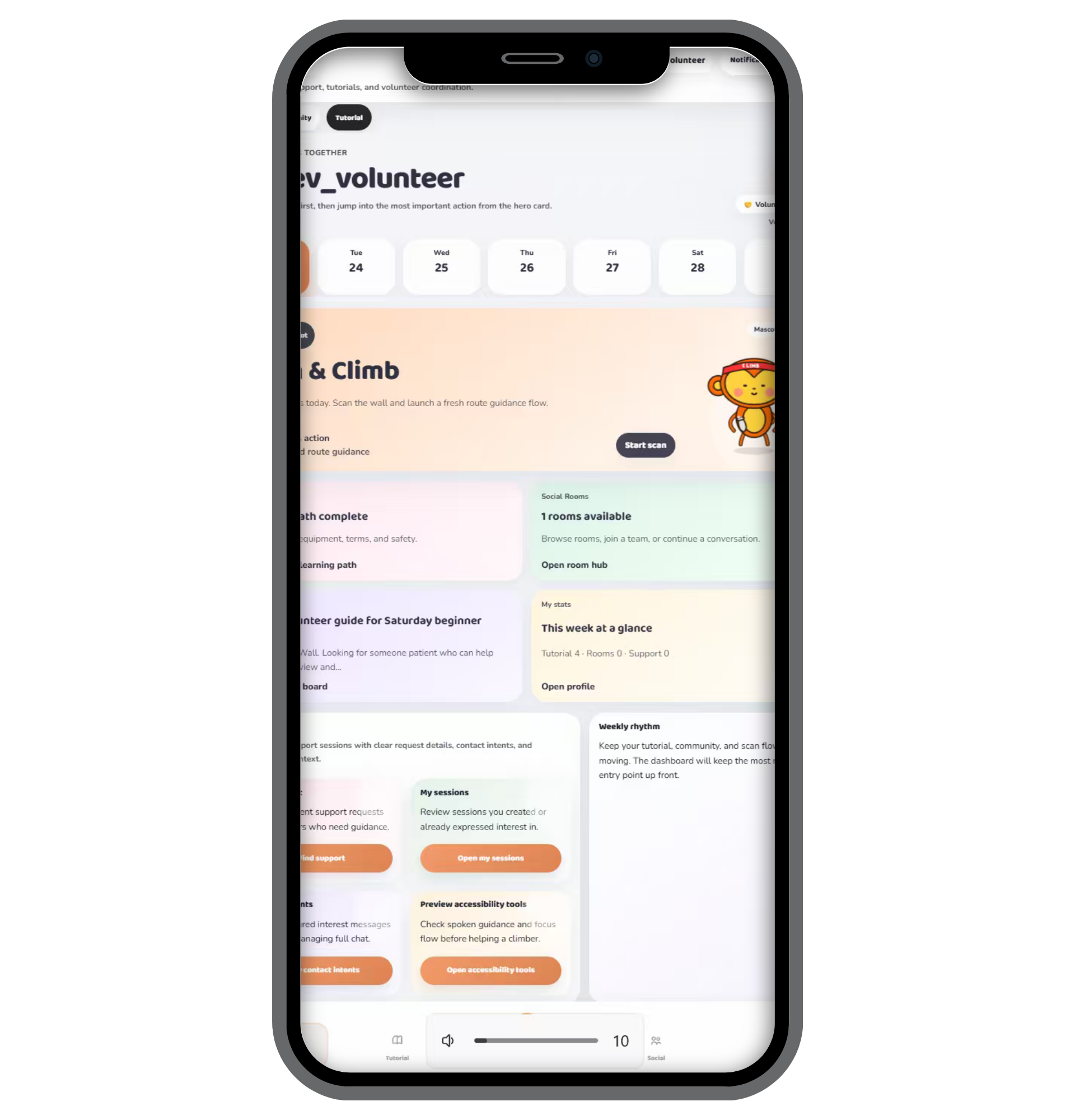
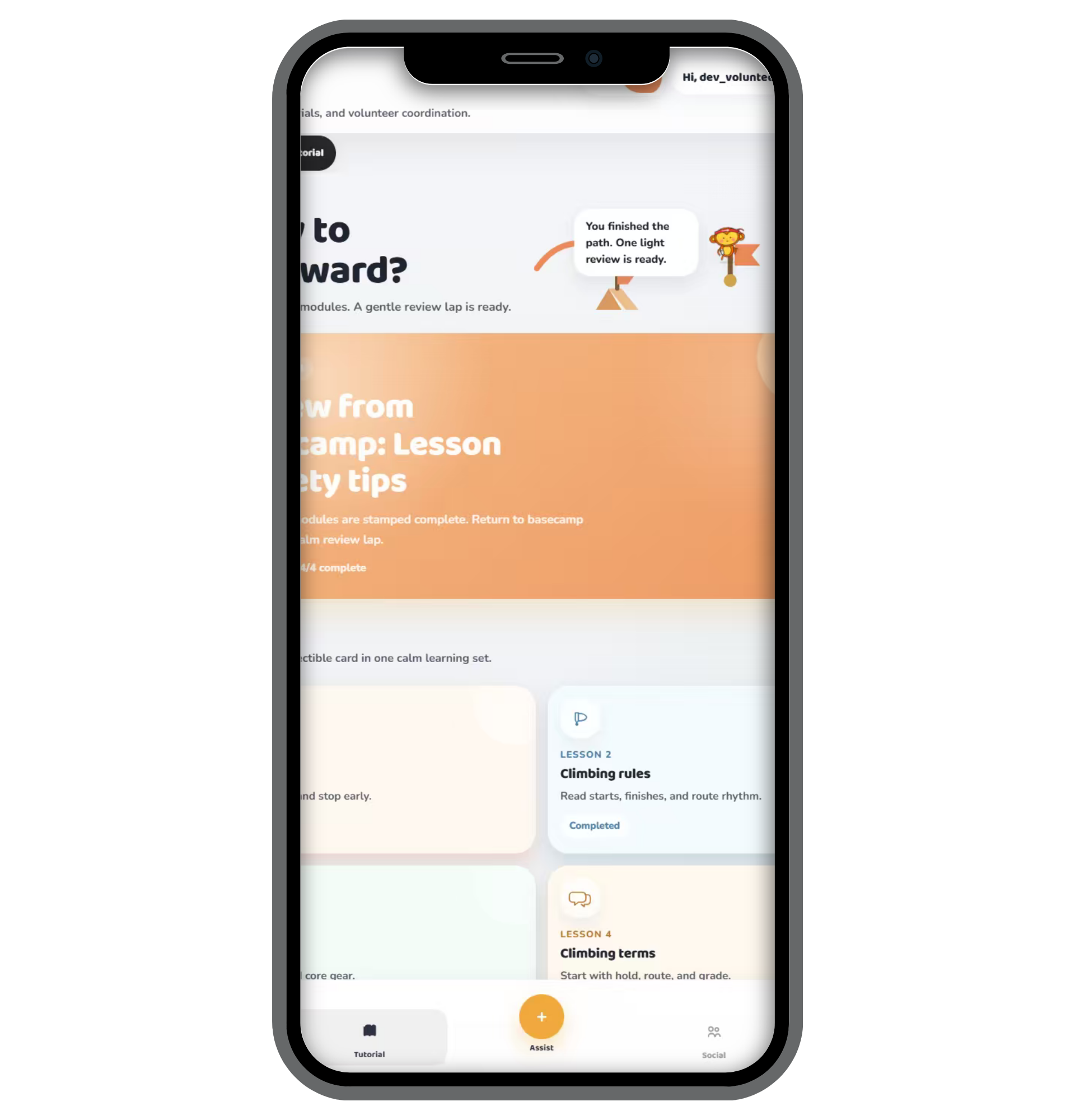
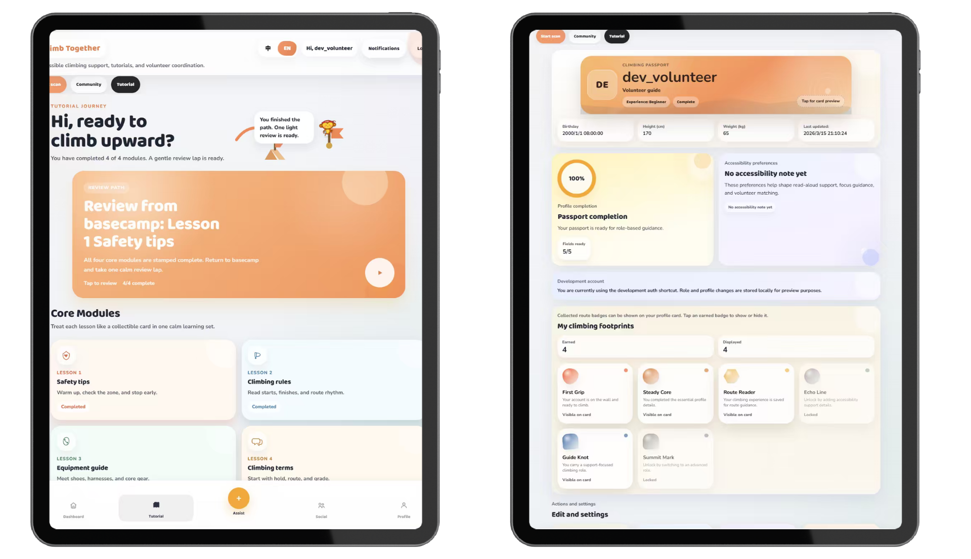
The UI direction changed across three major stages: from a simple early interface, to a richer sports-app direction, and finally to a simplified accessibility-focused Hi-Fi prototype.

Prototype screen 1
Prototype screen 2
Prototype screen 3
Prototype screen 4
Prototype screen 5
Prototype screen 6
Prototype screen 7
Prototype screen 8
Prototype screen 9
Prototype screen 10
Prototype screen 11
Prototype screen 12
Alternatives

Design Direction Options

Alternative Strength Weakness Decision
Option A: Pre-climb route preview only Builds route understanding before ascent Little support during climbing Not enough alone
Option B: Detailed continuous in-climb guidance Strong real-time support Too much cognitive load, interrupts rhythm Rejected
Option C: Brief in-climb cueing only Lightweight and less disruptive Weak initial route understanding Not enough alone
Final: Layered preview + brief cueing + fallback Balances preparation, rhythm, and autonomy Still needs human safety support Chosen

Alternative Evaluation Method

We compared the design alternatives using five criteria derived from our user requirements: route understanding, cognitive load, in-climb actionability, autonomy, and implementation feasibility. Each criterion was scored from 1 to 5, where 1 means weak support and 5 means strong support. The final design was selected because it best balanced pre-climb preparation, low-overload guidance, user control, and practical implementation within our web-based prototype.

Alternative Route Understanding Cognitive Load In-Climb Actionability Autonomy Implementation Feasibility Total
Option A: Pre-Climb Route Preview and Review 4 4 1 3 5 17
Option B: Detailed In-Climb Guidance 3 2 5 2 3 15
Option C: Brief In-Climb Cueing 2 5 4 4 4 19
Final: Layered Pre-Climb Preview + Brief In-Climb Cueing 5 5 5 5 4 24

The matrix shows that Option A was strong for preparation but weak during climbing, while Option B provided strong real-time support but risked overload and reduced autonomy. Option C was lightweight and practical but did not sufficiently support initial route understanding. Therefore, we selected the combined final direction: layered pre-climb preview plus brief in-climb cueing, with explicit fallback for uncertain moments.

Stage 1

Stage 1 — Low-Fi Prototype

What it explored

  • A simple mobile interface structure.
  • Basic settings and early navigation.
  • A first attempt to make the climbing assistant approachable.

What worked

  • The interface was visually simple.
  • The main actions were easy to identify.

What it lacked

  • The design was still too basic for a complete climbing support workflow.
  • Accessibility needs were not yet strongly reflected.
  • Scan guidance had not yet become the clear center of the experience.
Low-Fi prototype screens. Scroll to review the first mobile structure and early task flow.
Stage 2

Stage 2 — Mid-Fi Prototype

What changed

  • The visual direction shifted to a green climbing / sports-app style.
  • More functions were added to make the product feel complete.
  • The design explored dashboard, route support, guidance, and richer app-like features.

Why we expanded it

  • We wanted to test whether a fuller sports-app structure would make the system feel more realistic.
  • We explored how HoldLight could support more than one climbing task.

What we learned

  • The product felt more complete, but also became too feature-heavy.
  • The richer structure risked increasing cognitive load for blind and low-vision users.
  • This pushed us to focus on clearer accessibility support instead of feature density.
Mid-Fi visual direction. Scroll to review the green sports-app interface screenshots.

Why the Design Changed

Shift 01

From simple to complete

The first version helped us test basic structure, but it did not yet support the full route guidance workflow. This led us to explore a richer app-like direction.

Shift 02

From complete to complex

The middle version added more features and looked more like a sports app, but it also created higher visual and interaction complexity.

Shift 03

From complex to focused

The final version reduced unnecessary functions and focused on the most important accessibility task: helping users scan, understand, and follow a climbing route with less cognitive load.

Final Design Direction

Brand Direction

Brand Direction: HoldLight

The HoldLight identity reflects the final direction of the product: a calm guiding light for climbers who cannot rely only on visual route information. After several iterations, the design became simpler, clearer, and more focused on accessible climbing support.

  • Mobile-first
  • Scan-first
  • Lower cognitive load
  • Short audio guidance
  • Accessible interaction
  • Simplified user flow
Next: Implementation